Introduction
Icons play an essential role in UI design, acting as visual shortcuts that improve user interaction, navigation, and overall experience. Whether it's guiding users through a mobile app or aiding in web navigation, well-designed icons can make an interface more intuitive and engaging.
In this comprehensive guide, we’ll explore the significance of icons in UI design, their various types, best practices for icon design, and how to effectively implement them.
What are icons in UI design?
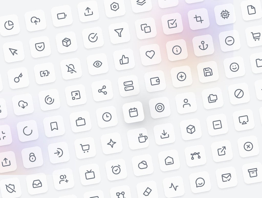
Icons are small graphical representations used to convey actions, features, or content within a user interface. They help users quickly understand functions without needing to read lengthy text, making navigation more efficient and interfaces cleaner.
Icons are used across web and mobile designs, from menu buttons to action items, notifications, and branding elements. They are integral to creating visually intuitive interfaces, improving user experience by reducing cognitive load and enhancing accessibility.
The importance of icons in UI design
Visual communication
Icons act as a visual language in UI design. They allow users to quickly recognize the purpose of buttons or actions without needing text. By using familiar, universal symbols (such as a shopping cart for e-commerce or a magnifying glass for search), you help users navigate with ease.
Improved navigation and usability
Icons simplify navigation by acting as interactive visual guides. Well-placed icons can direct users through an app or website without overwhelming them with text or complex instructions. For example, hamburger menus or icons like "home" and "settings" ensure users intuitively know where to go.
Space-saving in minimalist design
One of the greatest benefits of icons is their ability to save space. With minimal design trends becoming more popular, icons provide a clean, functional way to replace text-heavy labels. This creates more white space in your layout, improving readability and aesthetics.
Branding and recognition
Icons can be custom-designed to reflect a brand’s style and personality. Incorporating branded icons can help with visual recognition, making the interface feel unique and cohesive. These icons reinforce brand identity and create a memorable user experience.
Accessibility enhancement
Icons contribute to a more accessible design, especially when paired with supporting text or tooltips. By providing visual alternatives to text, icons help users with language barriers, cognitive disabilities, or low literacy better navigate the interface.
Types of icons in UI design
Functional icons
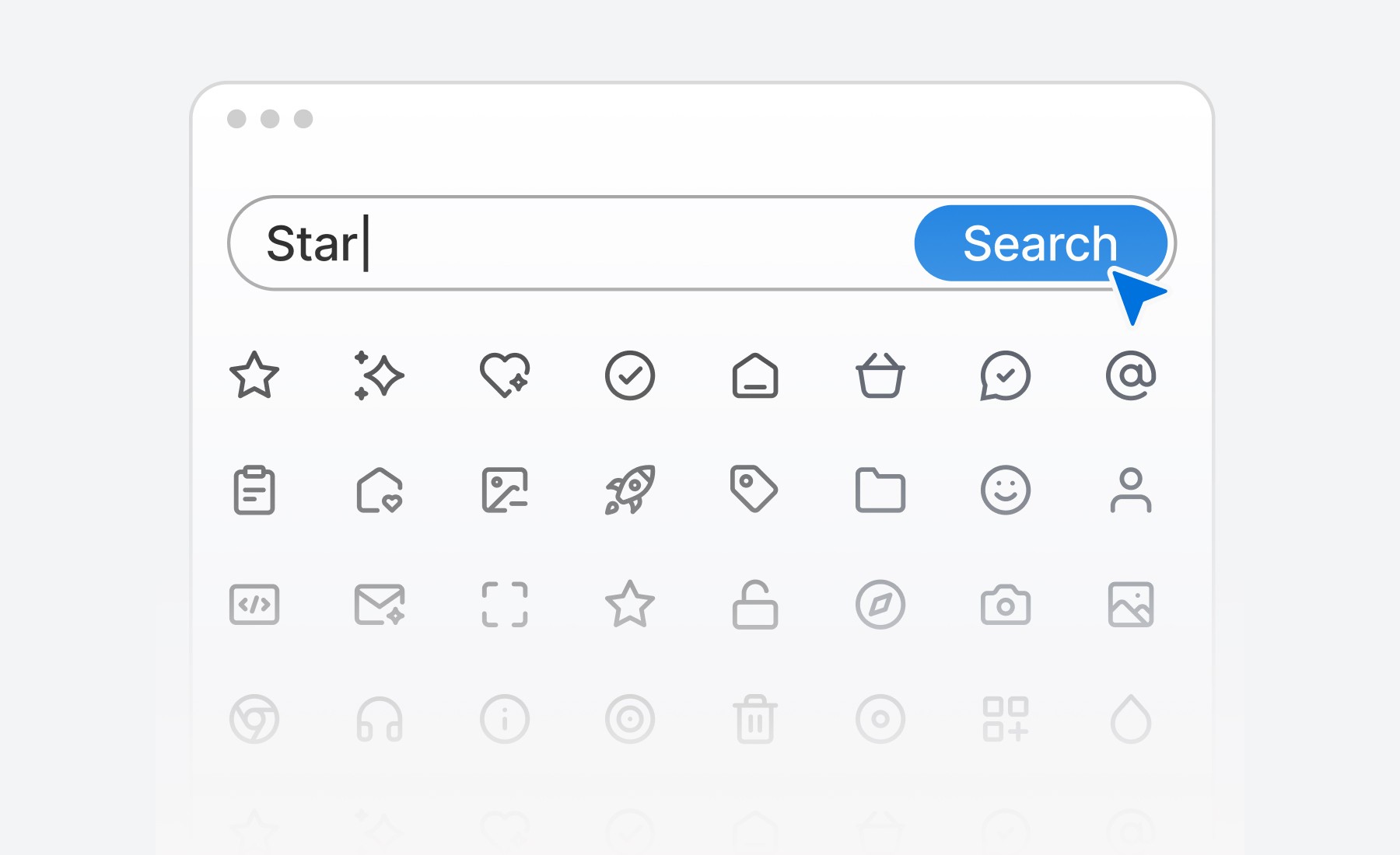
Functional icons represent specific actions or commands, such as play, pause, add to cart, or delete. These are the most common types of icons used in interfaces to improve usability and clarity.
Interactive icons
Interactive icons, such as buttons, switches, and toggles, indicate a user's ability to perform an action. For example, the "like" button or share icon allows users to interact with content.
Decorative icons
Decorative icons are purely aesthetic and used to complement the visual design of the interface. While they don't serve a functional purpose, they contribute to the overall mood and feel of the design.
Social media icons
Social media icons link users to external social platforms, such as Facebook, Twitter, Instagram, or LinkedIn. These icons are often placed in website footers or alongside shareable content.
Custom icons
Custom icons are tailored to fit a brand’s unique style. Custom-designed icons set the tone for a product, making the UI more engaging and aligned with the brand’s voice.

Best practices for using icons in UI design
Keep icons simple and recognizable
The primary purpose of an icon is to convey meaning at a glance. Avoid overcomplicating icons with too much detail. Stick to universally recognized symbols or simple designs that users can instantly understand.
Ensure consistency
Icons should maintain consistency in style, size, and alignment throughout the UI. Use a consistent color palette, stroke weight, and proportions across all icons. This uniformity enhances visual harmony and reduces cognitive load for users.
Provide text labels for clarity
While icons can often stand alone, some users may need extra clarity, especially for less common symbols. Pairing icons with text labels or tooltips ensures that their meaning is clear, making the interface accessible to all users.
Design for scalability
Ensure your icons are scalable for various screen sizes and resolutions. SVG (Scalable Vector Graphics) is an ideal format for icons, as it retains quality at any size without pixelation, from mobile screens to large desktops.
Use icons sparingly
Icons are powerful, but they should be used in moderation. Overloading a UI with too many icons can overwhelm the user and detract from the overall design. Focus on using icons where they truly add value and enhance usability.
How to implement icons effectively in your UI
Choose an icon library
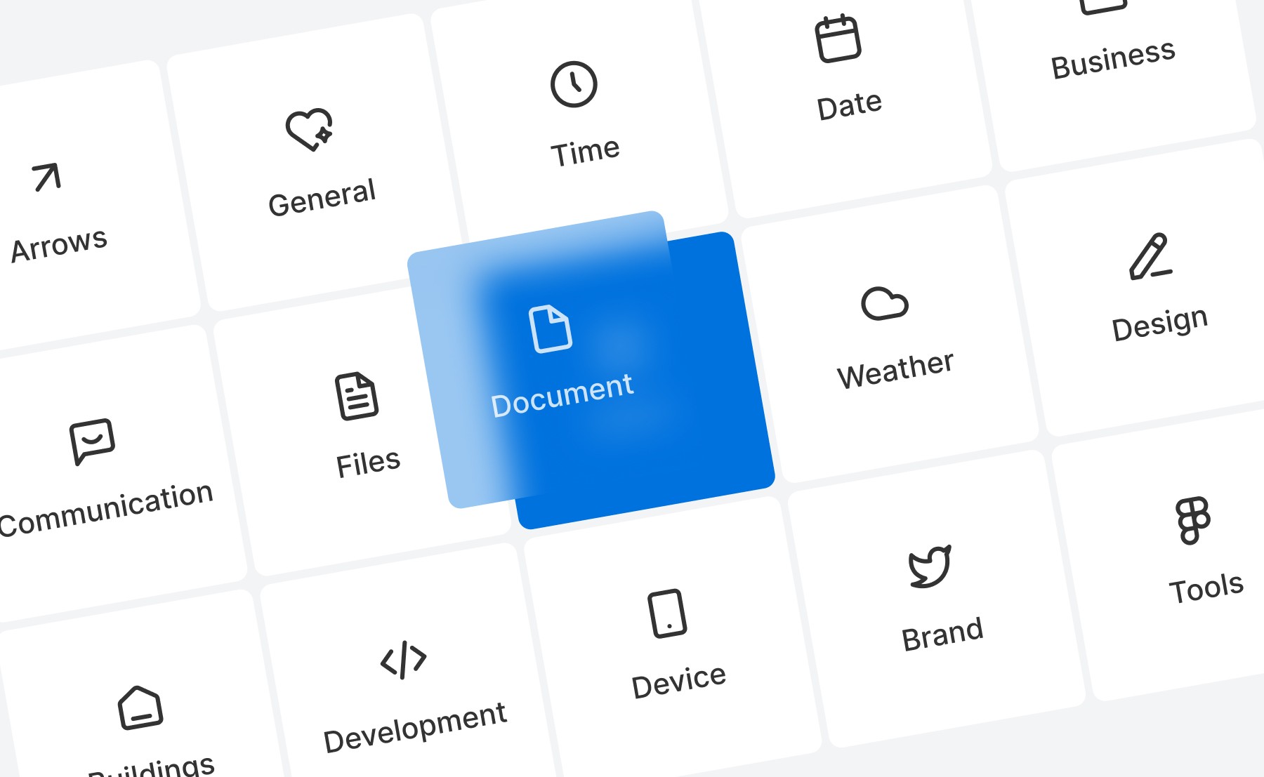
Icon libraries, such as Sublima Icons, Font Awesome, Material Icons, or Feather Icons, provide a wide selection of ready-made icons you can use in your UI. These libraries offer icons that are scalable, customizable, and come in various styles (line, solid, rounded) to fit your design needs.
Use custom icons for branding
For more personalized interfaces, consider creating custom icons that align with your brand’s visual identity. Tools like Adobe Illustrator or Figma allow you to create vector-based custom icons.
Optimize for mobile
Ensure that your icons are touch-friendly on mobile devices. They should be large enough to tap without accidentally pressing adjacent elements, and their spacing should be optimized for smaller screens.
Test for accessibility
Icons should be easily distinguishable and offer enough contrast against the background for users with visual impairments. It's also a good practice to ensure that all icons have alt-text or aria labels for screen readers, making them accessible to visually impaired users.
Stay updated with icon trends
Icon trends evolve over time. From skeuomorphic to flat design, and now toward more minimal and animated icons, staying current with design trends can help you keep your UI fresh and modern.
Benefits of using icons in UI design
Faster navigation
Icons speed up navigation by allowing users to quickly understand and perform actions. For example, icons in toolbars or sidebars help users find features or content without needing to read through menus.
Enhanced visual appeal
Icons contribute to the overall visual appeal of your design by breaking up text-heavy content and providing focal points. They make interfaces more engaging and reduce monotony.
Increased usability
By providing clear visual cues, icons improve usability. They guide users through complex interactions and ensure they can intuitively understand what actions are possible.
Common mistakes to avoid
Using ambiguous icons
Icons should be instantly recognizable. Avoid using obscure or abstract icons that users may misinterpret, leading to confusion or frustration.
Overloading with icons
Too many icons can overwhelm users and clutter the interface. Prioritize essential icons and remove unnecessary decorative icons that don’t add functional value.
Inconsistent icon styles
Mixing different styles of icons (e.g., solid, outline, filled) can create a disjointed user experience. Stick to a cohesive style to ensure visual harmony throughout the UI.
Implementing icons with Sublima UI
With Sublima UI, we simplify the integration of icons into your UI designs by offering a vast collection of ready-made and customizable icons. Our icon library is designed to work seamlessly with the 4pt spacing system and the overall structure of the UI kit.
How Sublima UI Enhances Icon Usage:
Pre-built icon sets: Sublima UI includes a robust collection of icons covering common actions, social media, and custom branding, all optimized for scalability and usability.
Customizable design tokens: You can easily modify icon colors, sizes, and styles using our design tokens, ensuring they match your brand’s look and feel perfectly.
Mobile-optimized icons: All icons in Sublima UI are mobile-ready, with touch-friendly sizing and spacing for enhanced usability on smaller screens.
Explore Sublima UI Kit
What are icons in UI design?
Icons are small graphical representations used to convey actions, features, or content within a user interface. They help users quickly understand functions without needing to read lengthy text, making navigation more efficient and interfaces cleaner.
Icons are used across web and mobile designs, from menu buttons to action items, notifications, and branding elements. They are integral to creating visually intuitive interfaces, improving user experience by reducing cognitive load and enhancing accessibility.
The importance of icons in UI design
Visual communication
Icons act as a visual language in UI design. They allow users to quickly recognize the purpose of buttons or actions without needing text. By using familiar, universal symbols (such as a shopping cart for e-commerce or a magnifying glass for search), you help users navigate with ease.
Improved navigation and usability
Icons simplify navigation by acting as interactive visual guides. Well-placed icons can direct users through an app or website without overwhelming them with text or complex instructions. For example, hamburger menus or icons like "home" and "settings" ensure users intuitively know where to go.
Space-saving in minimalist design
One of the greatest benefits of icons is their ability to save space. With minimal design trends becoming more popular, icons provide a clean, functional way to replace text-heavy labels. This creates more white space in your layout, improving readability and aesthetics.
Branding and recognition
Icons can be custom-designed to reflect a brand’s style and personality. Incorporating branded icons can help with visual recognition, making the interface feel unique and cohesive. These icons reinforce brand identity and create a memorable user experience.
Accessibility enhancement
Icons contribute to a more accessible design, especially when paired with supporting text or tooltips. By providing visual alternatives to text, icons help users with language barriers, cognitive disabilities, or low literacy better navigate the interface.

Types of icons in UI design
Functional icons
Functional icons represent specific actions or commands, such as play, pause, add to cart, or delete. These are the most common types of icons used in interfaces to improve usability and clarity.
Interactive icons
Interactive icons, such as buttons, switches, and toggles, indicate a user's ability to perform an action. For example, the "like" button or share icon allows users to interact with content.
Decorative icons
Decorative icons are purely aesthetic and used to complement the visual design of the interface. While they don't serve a functional purpose, they contribute to the overall mood and feel of the design.
Social media icons
Social media icons link users to external social platforms, such as Facebook, Twitter, Instagram, or LinkedIn. These icons are often placed in website footers or alongside shareable content.
Custom icons
Custom icons are tailored to fit a brand’s unique style. Custom-designed icons set the tone for a product, making the UI more engaging and aligned with the brand’s voice.

Best practices for using icons in UI design
Keep icons simple and recognizable
The primary purpose of an icon is to convey meaning at a glance. Avoid overcomplicating icons with too much detail. Stick to universally recognized symbols or simple designs that users can instantly understand.
Ensure consistency
Icons should maintain consistency in style, size, and alignment throughout the UI. Use a consistent color palette, stroke weight, and proportions across all icons. This uniformity enhances visual harmony and reduces cognitive load for users.
Provide text labels for clarity
While icons can often stand alone, some users may need extra clarity, especially for less common symbols. Pairing icons with text labels or tooltips ensures that their meaning is clear, making the interface accessible to all users.
Design for scalability
Ensure your icons are scalable for various screen sizes and resolutions. SVG (Scalable Vector Graphics) is an ideal format for icons, as it retains quality at any size without pixelation, from mobile screens to large desktops.
Use icons sparingly
Icons are powerful, but they should be used in moderation. Overloading a UI with too many icons can overwhelm the user and detract from the overall design. Focus on using icons where they truly add value and enhance usability.
How to implement icons effectively in your UI
Choose an icon library
Icon libraries, such as Sublima Icons, Font Awesome, Material Icons, or Feather Icons, provide a wide selection of ready-made icons you can use in your UI. These libraries offer icons that are scalable, customizable, and come in various styles (line, solid, rounded) to fit your design needs.
Use custom icons for branding
For more personalized interfaces, consider creating custom icons that align with your brand’s visual identity. Tools like Adobe Illustrator or Figma allow you to create vector-based custom icons.
Optimize for mobile
Ensure that your icons are touch-friendly on mobile devices. They should be large enough to tap without accidentally pressing adjacent elements, and their spacing should be optimized for smaller screens.
Test for accessibility
Icons should be easily distinguishable and offer enough contrast against the background for users with visual impairments. It's also a good practice to ensure that all icons have alt-text or aria labels for screen readers, making them accessible to visually impaired users.
Stay updated with icon trends
Icon trends evolve over time. From skeuomorphic to flat design, and now toward more minimal and animated icons, staying current with design trends can help you keep your UI fresh and modern.

Benefits of using icons in UI design
Faster navigation
Icons speed up navigation by allowing users to quickly understand and perform actions. For example, icons in toolbars or sidebars help users find features or content without needing to read through menus.
Enhanced visual appeal
Icons contribute to the overall visual appeal of your design by breaking up text-heavy content and providing focal points. They make interfaces more engaging and reduce monotony.
Increased usability
By providing clear visual cues, icons improve usability. They guide users through complex interactions and ensure they can intuitively understand what actions are possible.
Common mistakes to avoid
Using ambiguous icons
Icons should be instantly recognizable. Avoid using obscure or abstract icons that users may misinterpret, leading to confusion or frustration.
Overloading with icons
Too many icons can overwhelm users and clutter the interface. Prioritize essential icons and remove unnecessary decorative icons that don’t add functional value.
Inconsistent icon styles
Mixing different styles of icons (e.g., solid, outline, filled) can create a disjointed user experience. Stick to a cohesive style to ensure visual harmony throughout the UI.
Implementing icons with Sublima UI
With Sublima UI, we simplify the integration of icons into your UI designs by offering a vast collection of ready-made and customizable icons. Our icon library is designed to work seamlessly with the 4pt spacing system and the overall structure of the UI kit.
How Sublima UI Enhances Icon Usage:
Pre-built icon sets: Sublima UI includes a robust collection of icons covering common actions, social media, and custom branding, all optimized for scalability and usability.
Customizable design tokens: You can easily modify icon colors, sizes, and styles using our design tokens, ensuring they match your brand’s look and feel perfectly.
Mobile-optimized icons: All icons in Sublima UI are mobile-ready, with touch-friendly sizing and spacing for enhanced usability on smaller screens.
Explore Sublima UI Kit
What are icons in UI design?
Icons are small graphical representations used to convey actions, features, or content within a user interface. They help users quickly understand functions without needing to read lengthy text, making navigation more efficient and interfaces cleaner.
Icons are used across web and mobile designs, from menu buttons to action items, notifications, and branding elements. They are integral to creating visually intuitive interfaces, improving user experience by reducing cognitive load and enhancing accessibility.
The importance of icons in UI design
Visual communication
Icons act as a visual language in UI design. They allow users to quickly recognize the purpose of buttons or actions without needing text. By using familiar, universal symbols (such as a shopping cart for e-commerce or a magnifying glass for search), you help users navigate with ease.
Improved navigation and usability
Icons simplify navigation by acting as interactive visual guides. Well-placed icons can direct users through an app or website without overwhelming them with text or complex instructions. For example, hamburger menus or icons like "home" and "settings" ensure users intuitively know where to go.
Space-saving in minimalist design
One of the greatest benefits of icons is their ability to save space. With minimal design trends becoming more popular, icons provide a clean, functional way to replace text-heavy labels. This creates more white space in your layout, improving readability and aesthetics.
Branding and recognition
Icons can be custom-designed to reflect a brand’s style and personality. Incorporating branded icons can help with visual recognition, making the interface feel unique and cohesive. These icons reinforce brand identity and create a memorable user experience.
Accessibility enhancement
Icons contribute to a more accessible design, especially when paired with supporting text or tooltips. By providing visual alternatives to text, icons help users with language barriers, cognitive disabilities, or low literacy better navigate the interface.

Types of icons in UI design
Functional icons
Functional icons represent specific actions or commands, such as play, pause, add to cart, or delete. These are the most common types of icons used in interfaces to improve usability and clarity.
Interactive icons
Interactive icons, such as buttons, switches, and toggles, indicate a user's ability to perform an action. For example, the "like" button or share icon allows users to interact with content.
Decorative icons
Decorative icons are purely aesthetic and used to complement the visual design of the interface. While they don't serve a functional purpose, they contribute to the overall mood and feel of the design.
Social media icons
Social media icons link users to external social platforms, such as Facebook, Twitter, Instagram, or LinkedIn. These icons are often placed in website footers or alongside shareable content.
Custom icons
Custom icons are tailored to fit a brand’s unique style. Custom-designed icons set the tone for a product, making the UI more engaging and aligned with the brand’s voice.

Best practices for using icons in UI design
Keep icons simple and recognizable
The primary purpose of an icon is to convey meaning at a glance. Avoid overcomplicating icons with too much detail. Stick to universally recognized symbols or simple designs that users can instantly understand.
Ensure consistency
Icons should maintain consistency in style, size, and alignment throughout the UI. Use a consistent color palette, stroke weight, and proportions across all icons. This uniformity enhances visual harmony and reduces cognitive load for users.
Provide text labels for clarity
While icons can often stand alone, some users may need extra clarity, especially for less common symbols. Pairing icons with text labels or tooltips ensures that their meaning is clear, making the interface accessible to all users.
Design for scalability
Ensure your icons are scalable for various screen sizes and resolutions. SVG (Scalable Vector Graphics) is an ideal format for icons, as it retains quality at any size without pixelation, from mobile screens to large desktops.
Use icons sparingly
Icons are powerful, but they should be used in moderation. Overloading a UI with too many icons can overwhelm the user and detract from the overall design. Focus on using icons where they truly add value and enhance usability.
How to implement icons effectively in your UI
Choose an icon library
Icon libraries, such as Sublima Icons, Font Awesome, Material Icons, or Feather Icons, provide a wide selection of ready-made icons you can use in your UI. These libraries offer icons that are scalable, customizable, and come in various styles (line, solid, rounded) to fit your design needs.
Use custom icons for branding
For more personalized interfaces, consider creating custom icons that align with your brand’s visual identity. Tools like Adobe Illustrator or Figma allow you to create vector-based custom icons.
Optimize for mobile
Ensure that your icons are touch-friendly on mobile devices. They should be large enough to tap without accidentally pressing adjacent elements, and their spacing should be optimized for smaller screens.
Test for accessibility
Icons should be easily distinguishable and offer enough contrast against the background for users with visual impairments. It's also a good practice to ensure that all icons have alt-text or aria labels for screen readers, making them accessible to visually impaired users.
Stay updated with icon trends
Icon trends evolve over time. From skeuomorphic to flat design, and now toward more minimal and animated icons, staying current with design trends can help you keep your UI fresh and modern.

Benefits of using icons in UI design
Faster navigation
Icons speed up navigation by allowing users to quickly understand and perform actions. For example, icons in toolbars or sidebars help users find features or content without needing to read through menus.
Enhanced visual appeal
Icons contribute to the overall visual appeal of your design by breaking up text-heavy content and providing focal points. They make interfaces more engaging and reduce monotony.
Increased usability
By providing clear visual cues, icons improve usability. They guide users through complex interactions and ensure they can intuitively understand what actions are possible.
Common mistakes to avoid
Using ambiguous icons
Icons should be instantly recognizable. Avoid using obscure or abstract icons that users may misinterpret, leading to confusion or frustration.
Overloading with icons
Too many icons can overwhelm users and clutter the interface. Prioritize essential icons and remove unnecessary decorative icons that don’t add functional value.
Inconsistent icon styles
Mixing different styles of icons (e.g., solid, outline, filled) can create a disjointed user experience. Stick to a cohesive style to ensure visual harmony throughout the UI.
Implementing icons with Sublima UI
With Sublima UI, we simplify the integration of icons into your UI designs by offering a vast collection of ready-made and customizable icons. Our icon library is designed to work seamlessly with the 4pt spacing system and the overall structure of the UI kit.
How Sublima UI Enhances Icon Usage:
Pre-built icon sets: Sublima UI includes a robust collection of icons covering common actions, social media, and custom branding, all optimized for scalability and usability.
Customizable design tokens: You can easily modify icon colors, sizes, and styles using our design tokens, ensuring they match your brand’s look and feel perfectly.
Mobile-optimized icons: All icons in Sublima UI are mobile-ready, with touch-friendly sizing and spacing for enhanced usability on smaller screens.
Explore Sublima UI Kit
What are icons in UI design?
Icons are small graphical representations used to convey actions, features, or content within a user interface. They help users quickly understand functions without needing to read lengthy text, making navigation more efficient and interfaces cleaner.
Icons are used across web and mobile designs, from menu buttons to action items, notifications, and branding elements. They are integral to creating visually intuitive interfaces, improving user experience by reducing cognitive load and enhancing accessibility.
The importance of icons in UI design
Visual communication
Icons act as a visual language in UI design. They allow users to quickly recognize the purpose of buttons or actions without needing text. By using familiar, universal symbols (such as a shopping cart for e-commerce or a magnifying glass for search), you help users navigate with ease.
Improved navigation and usability
Icons simplify navigation by acting as interactive visual guides. Well-placed icons can direct users through an app or website without overwhelming them with text or complex instructions. For example, hamburger menus or icons like "home" and "settings" ensure users intuitively know where to go.
Space-saving in minimalist design
One of the greatest benefits of icons is their ability to save space. With minimal design trends becoming more popular, icons provide a clean, functional way to replace text-heavy labels. This creates more white space in your layout, improving readability and aesthetics.
Branding and recognition
Icons can be custom-designed to reflect a brand’s style and personality. Incorporating branded icons can help with visual recognition, making the interface feel unique and cohesive. These icons reinforce brand identity and create a memorable user experience.
Accessibility enhancement
Icons contribute to a more accessible design, especially when paired with supporting text or tooltips. By providing visual alternatives to text, icons help users with language barriers, cognitive disabilities, or low literacy better navigate the interface.

Types of icons in UI design
Functional icons
Functional icons represent specific actions or commands, such as play, pause, add to cart, or delete. These are the most common types of icons used in interfaces to improve usability and clarity.
Interactive icons
Interactive icons, such as buttons, switches, and toggles, indicate a user's ability to perform an action. For example, the "like" button or share icon allows users to interact with content.
Decorative icons
Decorative icons are purely aesthetic and used to complement the visual design of the interface. While they don't serve a functional purpose, they contribute to the overall mood and feel of the design.
Social media icons
Social media icons link users to external social platforms, such as Facebook, Twitter, Instagram, or LinkedIn. These icons are often placed in website footers or alongside shareable content.
Custom icons
Custom icons are tailored to fit a brand’s unique style. Custom-designed icons set the tone for a product, making the UI more engaging and aligned with the brand’s voice.

Best practices for using icons in UI design
Keep icons simple and recognizable
The primary purpose of an icon is to convey meaning at a glance. Avoid overcomplicating icons with too much detail. Stick to universally recognized symbols or simple designs that users can instantly understand.
Ensure consistency
Icons should maintain consistency in style, size, and alignment throughout the UI. Use a consistent color palette, stroke weight, and proportions across all icons. This uniformity enhances visual harmony and reduces cognitive load for users.
Provide text labels for clarity
While icons can often stand alone, some users may need extra clarity, especially for less common symbols. Pairing icons with text labels or tooltips ensures that their meaning is clear, making the interface accessible to all users.
Design for scalability
Ensure your icons are scalable for various screen sizes and resolutions. SVG (Scalable Vector Graphics) is an ideal format for icons, as it retains quality at any size without pixelation, from mobile screens to large desktops.
Use icons sparingly
Icons are powerful, but they should be used in moderation. Overloading a UI with too many icons can overwhelm the user and detract from the overall design. Focus on using icons where they truly add value and enhance usability.
How to implement icons effectively in your UI
Choose an icon library
Icon libraries, such as Sublima Icons, Font Awesome, Material Icons, or Feather Icons, provide a wide selection of ready-made icons you can use in your UI. These libraries offer icons that are scalable, customizable, and come in various styles (line, solid, rounded) to fit your design needs.
Use custom icons for branding
For more personalized interfaces, consider creating custom icons that align with your brand’s visual identity. Tools like Adobe Illustrator or Figma allow you to create vector-based custom icons.
Optimize for mobile
Ensure that your icons are touch-friendly on mobile devices. They should be large enough to tap without accidentally pressing adjacent elements, and their spacing should be optimized for smaller screens.
Test for accessibility
Icons should be easily distinguishable and offer enough contrast against the background for users with visual impairments. It's also a good practice to ensure that all icons have alt-text or aria labels for screen readers, making them accessible to visually impaired users.
Stay updated with icon trends
Icon trends evolve over time. From skeuomorphic to flat design, and now toward more minimal and animated icons, staying current with design trends can help you keep your UI fresh and modern.

Benefits of using icons in UI design
Faster navigation
Icons speed up navigation by allowing users to quickly understand and perform actions. For example, icons in toolbars or sidebars help users find features or content without needing to read through menus.
Enhanced visual appeal
Icons contribute to the overall visual appeal of your design by breaking up text-heavy content and providing focal points. They make interfaces more engaging and reduce monotony.
Increased usability
By providing clear visual cues, icons improve usability. They guide users through complex interactions and ensure they can intuitively understand what actions are possible.
Common mistakes to avoid
Using ambiguous icons
Icons should be instantly recognizable. Avoid using obscure or abstract icons that users may misinterpret, leading to confusion or frustration.
Overloading with icons
Too many icons can overwhelm users and clutter the interface. Prioritize essential icons and remove unnecessary decorative icons that don’t add functional value.
Inconsistent icon styles
Mixing different styles of icons (e.g., solid, outline, filled) can create a disjointed user experience. Stick to a cohesive style to ensure visual harmony throughout the UI.
Implementing icons with Sublima UI
With Sublima UI, we simplify the integration of icons into your UI designs by offering a vast collection of ready-made and customizable icons. Our icon library is designed to work seamlessly with the 4pt spacing system and the overall structure of the UI kit.
How Sublima UI Enhances Icon Usage:
Pre-built icon sets: Sublima UI includes a robust collection of icons covering common actions, social media, and custom branding, all optimized for scalability and usability.
Customizable design tokens: You can easily modify icon colors, sizes, and styles using our design tokens, ensuring they match your brand’s look and feel perfectly.
Mobile-optimized icons: All icons in Sublima UI are mobile-ready, with touch-friendly sizing and spacing for enhanced usability on smaller screens.
Explore Sublima UI Kit
What are icons in UI design?
Icons are small graphical representations used to convey actions, features, or content within a user interface. They help users quickly understand functions without needing to read lengthy text, making navigation more efficient and interfaces cleaner.
Icons are used across web and mobile designs, from menu buttons to action items, notifications, and branding elements. They are integral to creating visually intuitive interfaces, improving user experience by reducing cognitive load and enhancing accessibility.
The importance of icons in UI design
Visual communication
Icons act as a visual language in UI design. They allow users to quickly recognize the purpose of buttons or actions without needing text. By using familiar, universal symbols (such as a shopping cart for e-commerce or a magnifying glass for search), you help users navigate with ease.
Improved navigation and usability
Icons simplify navigation by acting as interactive visual guides. Well-placed icons can direct users through an app or website without overwhelming them with text or complex instructions. For example, hamburger menus or icons like "home" and "settings" ensure users intuitively know where to go.
Space-saving in minimalist design
One of the greatest benefits of icons is their ability to save space. With minimal design trends becoming more popular, icons provide a clean, functional way to replace text-heavy labels. This creates more white space in your layout, improving readability and aesthetics.
Branding and recognition
Icons can be custom-designed to reflect a brand’s style and personality. Incorporating branded icons can help with visual recognition, making the interface feel unique and cohesive. These icons reinforce brand identity and create a memorable user experience.
Accessibility enhancement
Icons contribute to a more accessible design, especially when paired with supporting text or tooltips. By providing visual alternatives to text, icons help users with language barriers, cognitive disabilities, or low literacy better navigate the interface.

Types of icons in UI design
Functional icons
Functional icons represent specific actions or commands, such as play, pause, add to cart, or delete. These are the most common types of icons used in interfaces to improve usability and clarity.
Interactive icons
Interactive icons, such as buttons, switches, and toggles, indicate a user's ability to perform an action. For example, the "like" button or share icon allows users to interact with content.
Decorative icons
Decorative icons are purely aesthetic and used to complement the visual design of the interface. While they don't serve a functional purpose, they contribute to the overall mood and feel of the design.
Social media icons
Social media icons link users to external social platforms, such as Facebook, Twitter, Instagram, or LinkedIn. These icons are often placed in website footers or alongside shareable content.
Custom icons
Custom icons are tailored to fit a brand’s unique style. Custom-designed icons set the tone for a product, making the UI more engaging and aligned with the brand’s voice.

Best practices for using icons in UI design
Keep icons simple and recognizable
The primary purpose of an icon is to convey meaning at a glance. Avoid overcomplicating icons with too much detail. Stick to universally recognized symbols or simple designs that users can instantly understand.
Ensure consistency
Icons should maintain consistency in style, size, and alignment throughout the UI. Use a consistent color palette, stroke weight, and proportions across all icons. This uniformity enhances visual harmony and reduces cognitive load for users.
Provide text labels for clarity
While icons can often stand alone, some users may need extra clarity, especially for less common symbols. Pairing icons with text labels or tooltips ensures that their meaning is clear, making the interface accessible to all users.
Design for scalability
Ensure your icons are scalable for various screen sizes and resolutions. SVG (Scalable Vector Graphics) is an ideal format for icons, as it retains quality at any size without pixelation, from mobile screens to large desktops.
Use icons sparingly
Icons are powerful, but they should be used in moderation. Overloading a UI with too many icons can overwhelm the user and detract from the overall design. Focus on using icons where they truly add value and enhance usability.
How to implement icons effectively in your UI
Choose an icon library
Icon libraries, such as Sublima Icons, Font Awesome, Material Icons, or Feather Icons, provide a wide selection of ready-made icons you can use in your UI. These libraries offer icons that are scalable, customizable, and come in various styles (line, solid, rounded) to fit your design needs.
Use custom icons for branding
For more personalized interfaces, consider creating custom icons that align with your brand’s visual identity. Tools like Adobe Illustrator or Figma allow you to create vector-based custom icons.
Optimize for mobile
Ensure that your icons are touch-friendly on mobile devices. They should be large enough to tap without accidentally pressing adjacent elements, and their spacing should be optimized for smaller screens.
Test for accessibility
Icons should be easily distinguishable and offer enough contrast against the background for users with visual impairments. It's also a good practice to ensure that all icons have alt-text or aria labels for screen readers, making them accessible to visually impaired users.
Stay updated with icon trends
Icon trends evolve over time. From skeuomorphic to flat design, and now toward more minimal and animated icons, staying current with design trends can help you keep your UI fresh and modern.

Benefits of using icons in UI design
Faster navigation
Icons speed up navigation by allowing users to quickly understand and perform actions. For example, icons in toolbars or sidebars help users find features or content without needing to read through menus.
Enhanced visual appeal
Icons contribute to the overall visual appeal of your design by breaking up text-heavy content and providing focal points. They make interfaces more engaging and reduce monotony.
Increased usability
By providing clear visual cues, icons improve usability. They guide users through complex interactions and ensure they can intuitively understand what actions are possible.
Common mistakes to avoid
Using ambiguous icons
Icons should be instantly recognizable. Avoid using obscure or abstract icons that users may misinterpret, leading to confusion or frustration.
Overloading with icons
Too many icons can overwhelm users and clutter the interface. Prioritize essential icons and remove unnecessary decorative icons that don’t add functional value.
Inconsistent icon styles
Mixing different styles of icons (e.g., solid, outline, filled) can create a disjointed user experience. Stick to a cohesive style to ensure visual harmony throughout the UI.
Implementing icons with Sublima UI
With Sublima UI, we simplify the integration of icons into your UI designs by offering a vast collection of ready-made and customizable icons. Our icon library is designed to work seamlessly with the 4pt spacing system and the overall structure of the UI kit.
How Sublima UI Enhances Icon Usage:
Pre-built icon sets: Sublima UI includes a robust collection of icons covering common actions, social media, and custom branding, all optimized for scalability and usability.
Customizable design tokens: You can easily modify icon colors, sizes, and styles using our design tokens, ensuring they match your brand’s look and feel perfectly.
Mobile-optimized icons: All icons in Sublima UI are mobile-ready, with touch-friendly sizing and spacing for enhanced usability on smaller screens.
Explore Sublima UI Kit
Conclusion
Icons play a vital role in creating intuitive, visually appealing interfaces that enhance user experience and guide interactions. By following best practices, choosing the right icon types, and placing them thoughtfully, designers can craft interfaces that feel seamless and engaging.
Icons are more than just visuals—they’re a key part of how users understand and navigate your product. With careful selection and implementation, you can ensure that your icons communicate clearly and elevate the overall design, making your UI both functional and delightful for users.
Related Blogs
Related Blogs
Related Blogs
Related Blogs
Our latest news and articles
Get Sublima UI Today & Elevate Your Design Skills
Dive into our collection of pre-built UI components and landing page layouts to streamline your workflow and craft remarkable, professional designs in no time.
© 2024 Sublima. All rights reserved.
Get Sublima UI Today & Elevate Your Design Skills
Dive into our collection of pre-built UI components and landing page layouts to streamline your workflow and craft remarkable, professional designs in no time.
© 2024 Sublima. All rights reserved.
Get Sublima UI Today & Elevate Your Design Skills
Dive into our collection of pre-built UI components and landing page layouts to streamline your workflow and craft remarkable, professional designs in no time.
© 2024 Sublima. All rights reserved.
Get Sublima UI Today & Elevate Your Design Skills
Dive into our collection of pre-built UI components and landing page layouts to streamline your workflow and craft remarkable, professional designs in no time.
© 2024 Sublima. All rights reserved.


