Introduction
In today’s competitive digital landscape, having a clean and functional website isn’t just a nice-to-have — it’s essential. A modern website should not only look great but also provide a seamless experience across devices. Whether you're designing a landing page, portfolio, or SaaS platform, the right UI components can save you time, increase conversion, and boost overall usability.
At Sublima UI, we’ve curated a powerful set of design components that are fully responsive, easy to customize, and built to modern web standards. Below, we’ll explore the top 10 components every modern website needs — and how Sublima UI makes implementing them effortless.

1. Hero Section
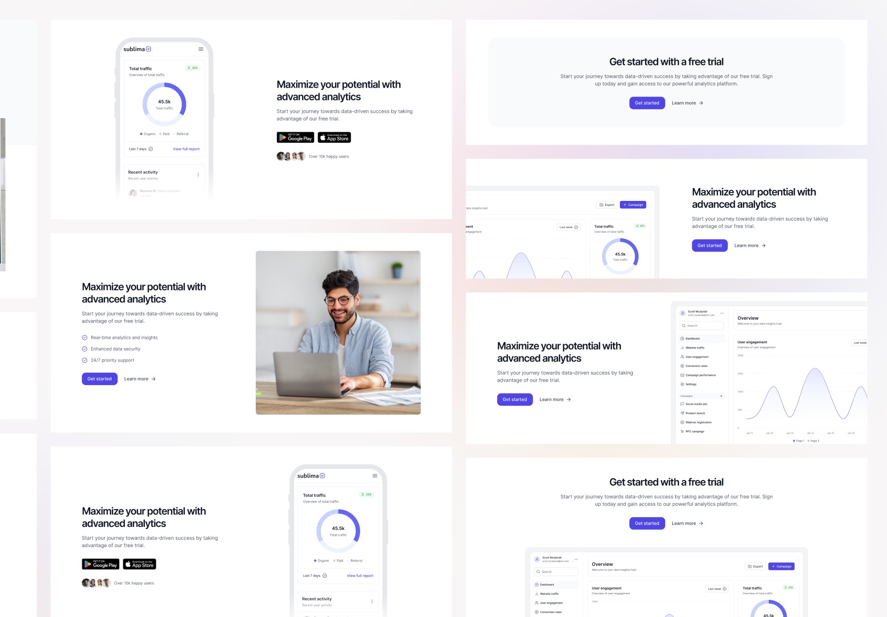
The hero section is your website’s first impression — and first impressions matter. It’s typically the first thing users see, and it should clearly communicate your core message or value proposition. Sublima UI offers multiple hero layouts with flexible content alignment, customizable headings, background image support, and prominent CTAs — ideal for conversions.

2. Navigation Bar (Navbar)
An intuitive navigation bar ensures users can easily explore your website. With Sublima UI, you get pre-built navbar layouts in horizontal and vertical styles, mobile-friendly toggle menus, and support for dropdowns and search — all fully adaptive for dark mode and responsive design.
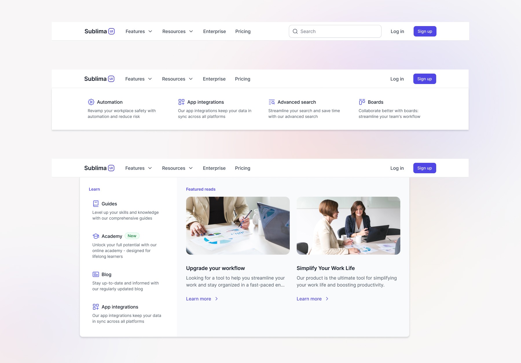
3. Features Section
Use this section to highlight what sets your product apart. Sublima’s features sections are built using flexible grid layouts, clear iconography, and bold typography. Choose from several templates to match your brand’s tone and showcase product benefits effectively.

4. Testimonials
Adding social proof increases credibility and trust. Sublima UI includes stylish testimonial blocks with avatar support, carousel sliders, rating options, and quote formats — perfect for customer reviews, client feedback, or press mentions.

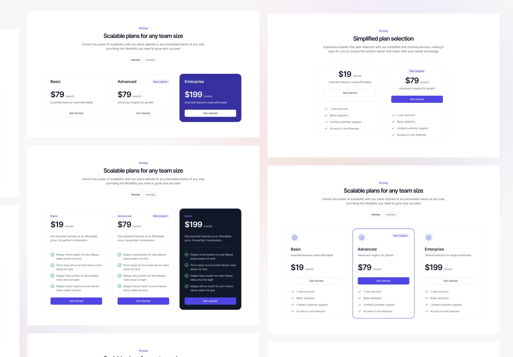
5. Pricing Tables
Essential for SaaS or eCommerce websites, Sublima’s responsive pricing tables allow easy toggling between monthly and yearly plans, include highlighted popular plans, and have clear CTAs. All components are easy to edit and adapt to your branding.
6. Call to Action (CTA) Blocks
CTAs guide users toward action — whether it's signing up, downloading, or getting in touch. Sublima UI includes a variety of CTA blocks with bold buttons, layered backgrounds, and engaging layouts that grab attention without overwhelming the design.
7. Avatars
Whether you're showcasing team members, user reviews, or community engagement, avatars add a human touch. Sublima’s avatar library includes circular, square, and placeholder styles with initials, images, and status indicators.

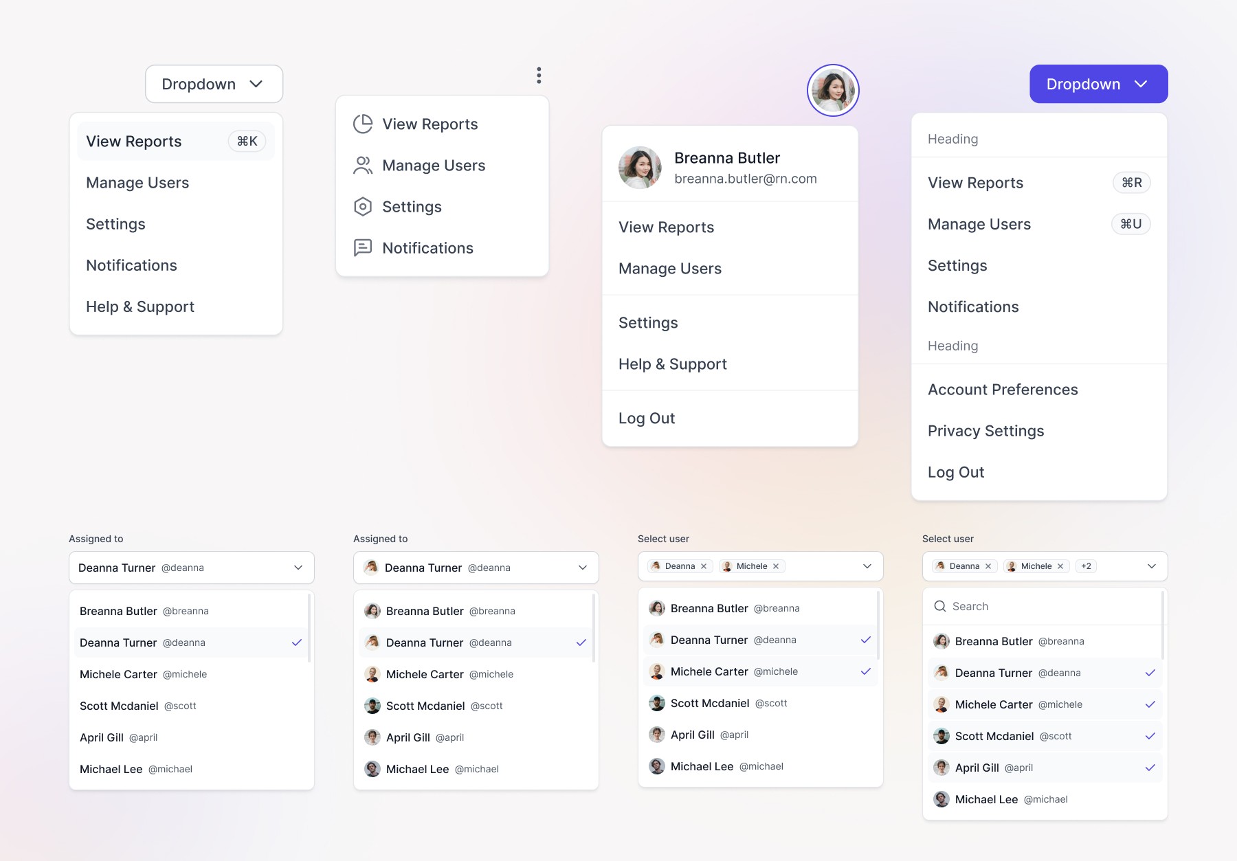
8. Command Menus
For modern web apps, a command menu offers powerful navigation via keyboard or search-style inputs. Sublima’s command menu components are built with accessibility in mind and follow best UX practices for speed and usability.

9. Dropdowns and Select Menus
Dropdowns are fundamental UI elements for navigation and forms. Sublima provides styled, accessible dropdowns and select menus with smooth transitions and full dark mode support — giving your forms and UI a polished look.
Explore Dropdown | Explore Select Menus
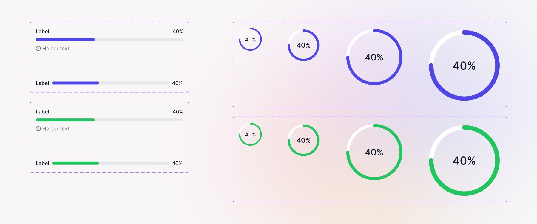
10. Progress Bars
Whether you're displaying loading states, achievements, or form completion steps — progress bars enhance user feedback. Sublima’s animated progress bars are fully customizable in color, shape, and size, and can be paired with labels or percentage markers.
Why Use Sublima UI?
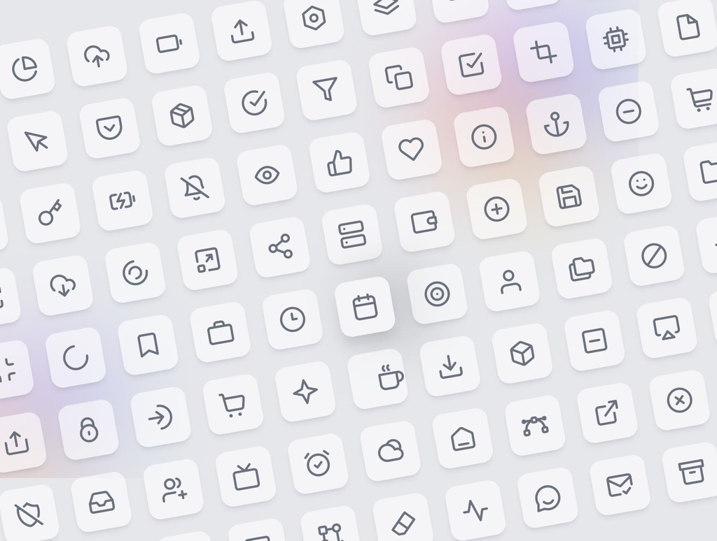
With Sublima UI, we simplify the integration of icons into your UI designs by offering a vast collection of ready-made and customizable icons. Our icon library is designed to work seamlessly with the 4pt spacing system and the overall structure of the UI kit.
How Sublima UI Enhances Icon Usage:
Pre-built icon sets: Sublima UI includes a robust collection of icons covering common actions, social media, and custom branding, all optimized for scalability and usability.
Customizable design tokens: You can easily modify icon colors, sizes, and styles using our design tokens, ensuring they match your brand’s look and feel perfectly.
Mobile-optimized icons: All icons in Sublima UI are mobile-ready, with touch-friendly sizing and spacing for enhanced usability on smaller screens.
Explore Sublima UI today and start designing smarter.
1. Hero Section
The hero section is your website’s first impression — and first impressions matter. It’s typically the first thing users see, and it should clearly communicate your core message or value proposition. Sublima UI offers multiple hero layouts with flexible content alignment, customizable headings, background image support, and prominent CTAs — ideal for conversions.
2. Navigation Bar (Navbar)
An intuitive navigation bar ensures users can easily explore your website. With Sublima UI, you get pre-built navbar layouts in horizontal and vertical styles, mobile-friendly toggle menus, and support for dropdowns and search — all fully adaptive for dark mode and responsive design.
3. Features Section
Use this section to highlight what sets your product apart. Sublima’s features sections are built using flexible grid layouts, clear iconography, and bold typography. Choose from several templates to match your brand’s tone and showcase product benefits effectively.
4. Testimonials
Adding social proof increases credibility and trust. Sublima UI includes stylish testimonial blocks with avatar support, carousel sliders, rating options, and quote formats — perfect for customer reviews, client feedback, or press mentions.
5. Pricing Tables
Essential for SaaS or eCommerce websites, Sublima’s responsive pricing tables allow easy toggling between monthly and yearly plans, include highlighted popular plans, and have clear CTAs. All components are easy to edit and adapt to your branding.
6. Call to Action (CTA) Blocks
CTAs guide users toward action — whether it's signing up, downloading, or getting in touch. Sublima UI includes a variety of CTA blocks with bold buttons, layered backgrounds, and engaging layouts that grab attention without overwhelming the design.
7. Avatars
Whether you're showcasing team members, user reviews, or community engagement, avatars add a human touch. Sublima’s avatar library includes circular, square, and placeholder styles with initials, images, and status indicators.
8. Command Menus
For modern web apps, a command menu offers powerful navigation via keyboard or search-style inputs. Sublima’s command menu components are built with accessibility in mind and follow best UX practices for speed and usability.
9. Dropdowns and Select Menus
Dropdowns are fundamental UI elements for navigation and forms. Sublima provides styled, accessible dropdowns and select menus with smooth transitions and full dark mode support — giving your forms and UI a polished look.
Explore Dropdown | Explore Select Menus
10. Progress Bars
Whether you're displaying loading states, achievements, or form completion steps — progress bars enhance user feedback. Sublima’s animated progress bars are fully customizable in color, shape, and size, and can be paired with labels or percentage markers.
Why Use Sublima UI?
With Sublima UI, we simplify the integration of icons into your UI designs by offering a vast collection of ready-made and customizable icons. Our icon library is designed to work seamlessly with the 4pt spacing system and the overall structure of the UI kit.
How Sublima UI Enhances Icon Usage:
Pre-built icon sets: Sublima UI includes a robust collection of icons covering common actions, social media, and custom branding, all optimized for scalability and usability.
Customizable design tokens: You can easily modify icon colors, sizes, and styles using our design tokens, ensuring they match your brand’s look and feel perfectly.
Mobile-optimized icons: All icons in Sublima UI are mobile-ready, with touch-friendly sizing and spacing for enhanced usability on smaller screens.
Explore Sublima UI today and start designing smarter.
Conclusion
Creating a modern website today means more than just writing clean code — it’s about delivering exceptional user experiences with thoughtfully designed components. From eye-catching hero sections to interactive command menus, each piece plays a crucial role in how users perceive and interact with your brand.
Sublima UI takes the guesswork out of design by offering a comprehensive library of ready-to-use components that follow the latest trends, accessibility standards, and best practices. Whether you’re launching a new product or refining an existing one, Sublima helps you move faster while maintaining a polished, professional look.
If you're ready to level up your design workflow, give Sublima a try and see how effortlessly your next website comes together.

Related Blogs
Related Blogs
Related Blogs
Related Blogs
Our latest news and articles


Get Sublima UI Today & Elevate Your Design Skills
Dive into our collection of pre-built UI components and landing page layouts to streamline your workflow and craft remarkable, professional designs in no time.
© 2024 Sublima. All rights reserved.
Get Sublima UI Today & Elevate Your Design Skills
Dive into our collection of pre-built UI components and landing page layouts to streamline your workflow and craft remarkable, professional designs in no time.
© 2024 Sublima. All rights reserved.
Get Sublima UI Today & Elevate Your Design Skills
Dive into our collection of pre-built UI components and landing page layouts to streamline your workflow and craft remarkable, professional designs in no time.
© 2024 Sublima. All rights reserved.
Get Sublima UI Today & Elevate Your Design Skills
Dive into our collection of pre-built UI components and landing page layouts to streamline your workflow and craft remarkable, professional designs in no time.
© 2024 Sublima. All rights reserved.