Introduction
Dark mode isn’t just a trend — it’s a user-driven feature that’s reshaping modern UI/UX design. From mobile apps to web dashboards, dark mode has become a standard expectation for products focused on accessibility, battery efficiency, and visual comfort. If you're building a design system or product interface, supporting dark mode is no longer optional — it’s essential.
In this blog, we’ll explore why dark mode matters, the challenges of implementing it in design systems, and how Sublima UI simplifies the entire process with its flexible, token-based setup.
Why Dark Mode Matters
1. User Preference
With the rise of personalization, users want control over how interfaces look and feel. Many now default to dark mode not just for aesthetics but for comfort and focus. Supporting dark mode enhances user satisfaction and engagement.
2. Reduced Eye Strain
Dark backgrounds with light text reduce eye strain in low-light environments. This is especially beneficial for users working long hours on screens or using apps at night.
3. Battery Efficiency
On OLED and AMOLED displays, dark mode can significantly conserve battery life, since fewer pixels are illuminated. This technical benefit is another reason why users prefer it.
4. Modern & Sleek Aesthetic
Dark mode feels modern and high-tech. It allows UI elements, colors, and visual hierarchies to stand out, especially when paired with vibrant accents.
The Challenge of Implementing Dark Mode in Design Systems
While it sounds simple, dark mode adds complexity to your design system. Here’s why:
Design token duplication: You need separate values for text, background, and surfaces.
Contrast compliance: It’s easy to end up with poor contrast, making content hard to read.
Component adaptability: Each component (buttons, cards, inputs) must support both modes consistently.
Theming structure: Without a scalable approach, maintaining light/dark variants becomes a chore.
That’s where a well-thought-out design system like Sublima UI comes in.
How Sublima UI Makes Dark Mode Easy
Sublima UI is built with flexibility and scalability at its core. Dark mode support is not an afterthought — it’s deeply integrated into the foundation of the system. Here's how:
✅ Token-Based Theming
Sublima uses design tokens for color variables, making dark mode a seamless switch rather than a redesign. You’ll find:
Surface tokens:
bg-primary,bg-secondary,bg-warning, etc.Text tokens:
heading-primary,heading-secondary,text-strongButton tokens:
fg-button-primary,bg-button-primary-hover, etc.
These tokens are mapped separately for light and dark themes, so switching the theme updates the entire UI automatically.

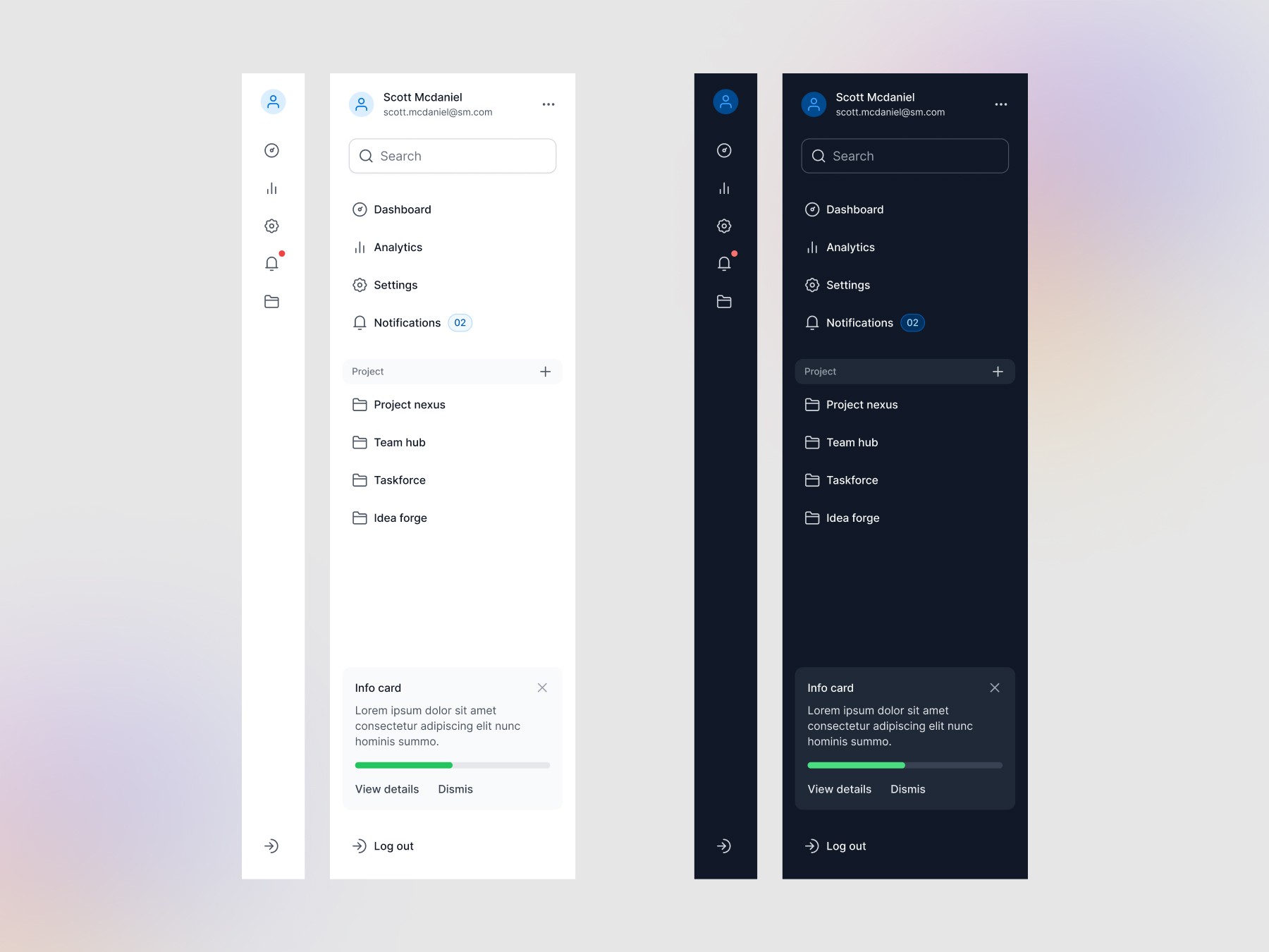
🎨 Components Ready for Both Modes
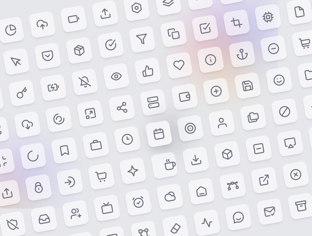
Every component in Sublima — from buttons and inputs to modals and command menus — is designed to respond to theme changes instantly.
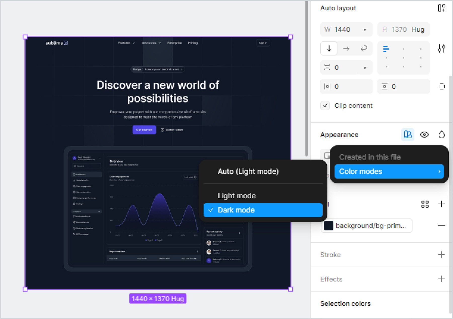
🌗 Easy Toggle & Preview
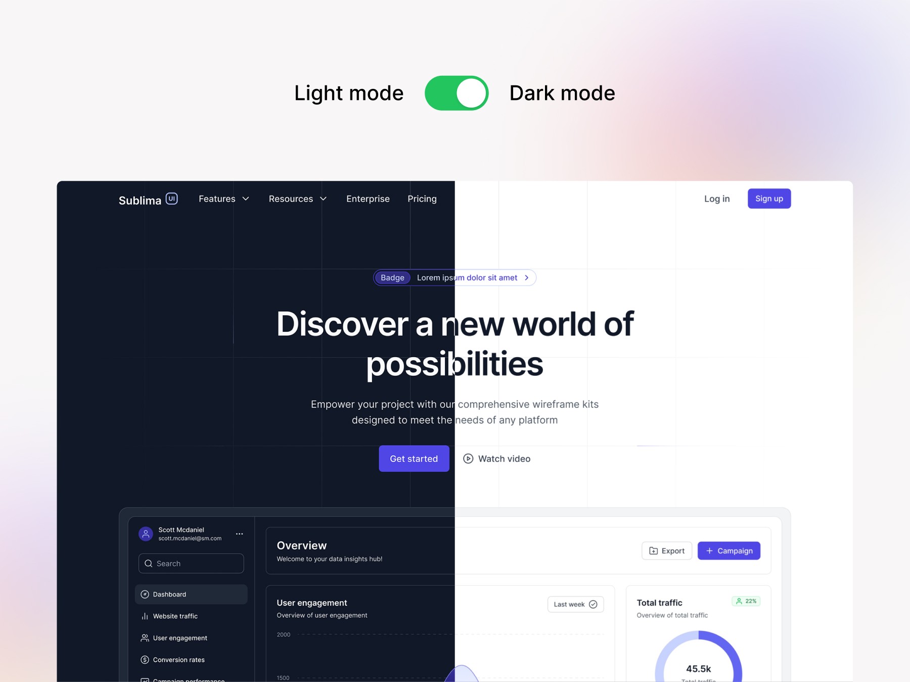
Whether you’re working in Figma or on a live project, switching between light and dark is as simple as toggling a setting. Preview how your entire design behaves in both modes without rebuilding anything.
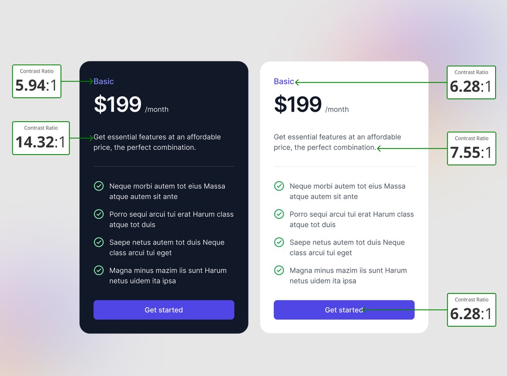
🔍 Accessible Contrast by Default
Sublima follows WCAG accessibility guidelines to ensure your text and interactive elements meet contrast requirements in both themes. You don’t have to worry about legibility — it’s already handled.
Why Dark Mode Matters
1. User Preference
With the rise of personalization, users want control over how interfaces look and feel. Many now default to dark mode not just for aesthetics but for comfort and focus. Supporting dark mode enhances user satisfaction and engagement.
2. Reduced Eye Strain
Dark backgrounds with light text reduce eye strain in low-light environments. This is especially beneficial for users working long hours on screens or using apps at night.
3. Battery Efficiency
On OLED and AMOLED displays, dark mode can significantly conserve battery life, since fewer pixels are illuminated. This technical benefit is another reason why users prefer it.
4. Modern & Sleek Aesthetic
Dark mode feels modern and high-tech. It allows UI elements, colors, and visual hierarchies to stand out, especially when paired with vibrant accents.
The Challenge of Implementing Dark Mode in Design Systems
While it sounds simple, dark mode adds complexity to your design system. Here’s why:
Design token duplication: You need separate values for text, background, and surfaces.
Contrast compliance: It’s easy to end up with poor contrast, making content hard to read.
Component adaptability: Each component (buttons, cards, inputs) must support both modes consistently.
Theming structure: Without a scalable approach, maintaining light/dark variants becomes a chore.
That’s where a well-thought-out design system like Sublima UI comes in.
How Sublima UI Makes Dark Mode Easy
Sublima UI is built with flexibility and scalability at its core. Dark mode support is not an afterthought — it’s deeply integrated into the foundation of the system. Here's how:
✅ Token-Based Theming
Sublima uses design tokens for color variables, making dark mode a seamless switch rather than a redesign. You’ll find:
Surface tokens:
bg-primary,bg-secondary,bg-warning, etc.Text tokens:
heading-primary,heading-secondary,text-strongButton tokens:
fg-button-primary,bg-button-primary-hover, etc.
These tokens are mapped separately for light and dark themes, so switching the theme updates the entire UI automatically.
🎨 Components Ready for Both Modes
Every component in Sublima — from buttons and inputs to modals and command menus — is designed to respond to theme changes instantly.
🌗 Easy Toggle & Preview
Whether you’re working in Figma or on a live project, switching between light and dark is as simple as toggling a setting. Preview how your entire design behaves in both modes without rebuilding anything.
🔍 Accessible Contrast by Default
Sublima follows WCAG accessibility guidelines to ensure your text and interactive elements meet contrast requirements in both themes. You don’t have to worry about legibility — it’s already handled.
Final Thoughts
Dark mode is more than a visual option — it's a critical part of user experience and brand identity. With Sublima, you don’t need to reinvent the wheel or juggle separate design files. Every component and token is built to support dark mode beautifully and reliably.
So whether you're designing for late-night coders, creative professionals, or everyday users, Sublima UI makes delivering a seamless dark mode experience easier than ever.

Related Blogs
Related Blogs
Related Blogs
Related Blogs
Our latest news and articles


Get Sublima UI Today & Elevate Your Design Skills
Dive into our collection of pre-built UI components and landing page layouts to streamline your workflow and craft remarkable, professional designs in no time.
© 2024 Sublima. All rights reserved.
Get Sublima UI Today & Elevate Your Design Skills
Dive into our collection of pre-built UI components and landing page layouts to streamline your workflow and craft remarkable, professional designs in no time.
© 2024 Sublima. All rights reserved.
Get Sublima UI Today & Elevate Your Design Skills
Dive into our collection of pre-built UI components and landing page layouts to streamline your workflow and craft remarkable, professional designs in no time.
© 2024 Sublima. All rights reserved.
Get Sublima UI Today & Elevate Your Design Skills
Dive into our collection of pre-built UI components and landing page layouts to streamline your workflow and craft remarkable, professional designs in no time.
© 2024 Sublima. All rights reserved.