Introduction
In the world of UI design, achieving consistency and visual balance is crucial to delivering a seamless user experience. One of the most effective ways to maintain this balance is by using a 4pt spacing system. This design approach standardizes spacing across all elements, resulting in clean, organized, and scalable layouts.
In this guide, we’ll take a deep dive into the 4pt spacing system, explore its benefits, and show you how to effectively implement it in your designs. By the end, you'll understand why the 4pt spacing system is widely adopted by design professionals and how it can elevate your design process.
What is the 4pt spacing system?
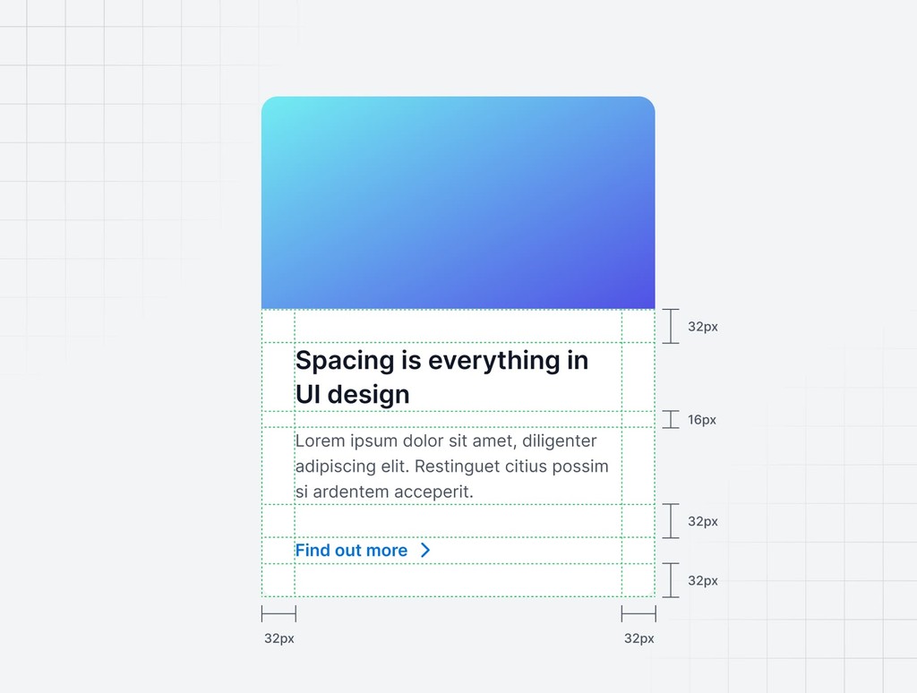
The 4pt spacing system is a grid-based method of spacing and sizing elements in UI design, using increments of 4 pixels (or points) as a foundation. This means that every element in the design, from margins to padding and even font sizes, aligns with multiples of 4. Whether you’re working on a mobile app or a web interface, the 4pt system ensures that your designs are consistently spaced and visually cohesive.
Why the 4pt spacing system is essential in UI design
Custom design, on the other hand, involves creating every element of your user interface from scratch. This approach allows for complete creative freedom and the ability to tailor every aspect of the design to your specific requirements. Custom design is typically more time-consuming and expensive, but it offers unparalleled flexibility and uniqueness.
Consistency across designs
One of the most significant advantages of the 4pt spacing system is the level of consistency it brings to your designs. When everything is aligned to the same base unit, the layout feels uniform, organized, and polished. Consistent spacing ensures that users can easily navigate the interface without distractions, creating a smoother experience.
Improved scalability
The 4pt system shines when it comes to scalability. Since every element adheres to the same base grid, it’s easier to scale your design across different devices and screen sizes. Whether you’re designing for mobile, tablet, or desktop, the 4pt spacing system ensures that your layouts maintain visual balance and proportionality.
Streamlined workflow
Once the 4pt system is in place, it simplifies decision-making during the design process. You won’t need to guess or manually calculate spacing for each component, which speeds up your workflow. The structure provides a clear framework, helping you focus on more creative and functional aspects of the design.
Developer-friendly implementation
Developers benefit from the 4pt spacing system as much as designers do. When you hand off your design, the 4pt grid makes it easier for developers to implement consistent spacing in code. This reduces back-and-forth adjustments, speeding up development and ensuring your design is faithfully translated into the final product.
How to implement the 4pt spacing system in UI design
Implementing the 4pt spacing system is straightforward but requires discipline to ensure consistent use throughout the design. Here’s how to get started:
Set up a 4pt grid
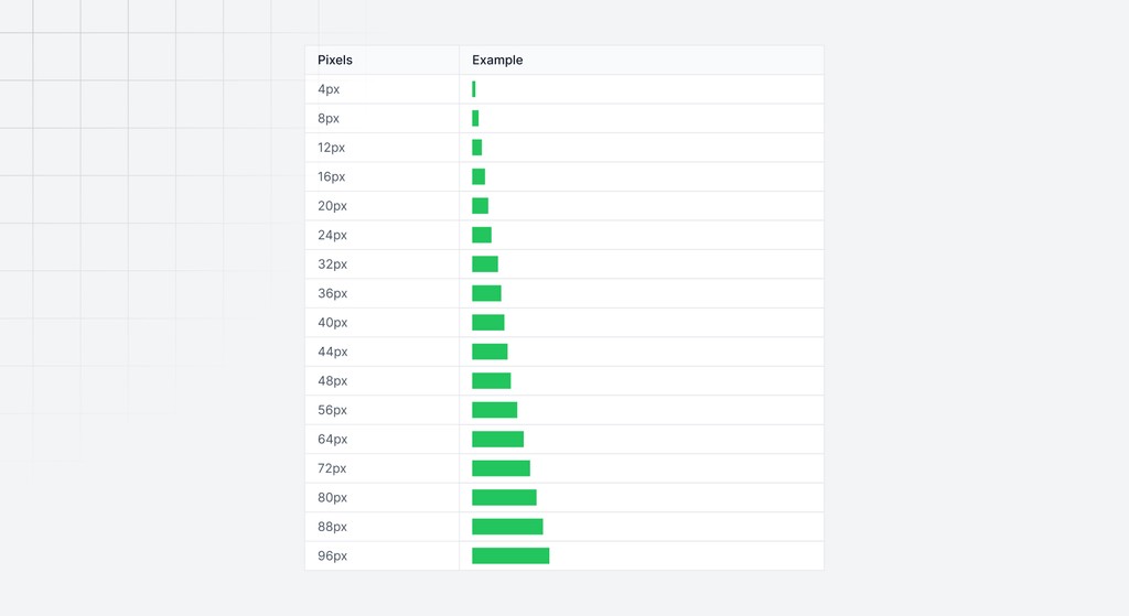
Begin by establishing a 4pt grid in your design tool (such as Figma, Sketch, or Adobe XD). This grid will act as the foundation for your entire layout. Ensure that every element aligns with the grid and its multiples 4, 8, 12, 16, and so on.
Apply consistent padding and margins
Use increments of 4 for spacing elements. For example, buttons could have 8px padding, while the spacing between sections could be 16px. This creates visual harmony across your design.
Use the 4pt system for component sizing
Not only should spacing follow the 4pt rule, but the sizing of components should also adhere to this system. For instance, if you’re designing a button, its height and width should both be divisible by 4, ensuring that it integrates well within the grid.
Align typography with the grid
Typography is a crucial element of any design, and it should also follow the 4pt rule. For example, use font sizes like 12px, 16px, or 24px, and set the line heights to multiples of 4 (e.g., 16px or 20px for readability).
Ensure consistency across breakpoints
When designing for responsive layouts, the 4pt system can easily scale with different breakpoints. Use larger increments for bigger devices and smaller increments for compact designs while keeping everything proportional.
Best practices for using the 4pt spacing system
Stick to the grid
The 4pt system relies on discipline. Avoid using arbitrary pixel values like 5px or 7px, as they disrupt the visual flow and complicate scalability.
Use larger multiples for spacious layouts
For larger gaps between elements, opt for multiples like 16px, 24px, or 32px. These larger increments help separate different sections, maintaining the overall balance without breaking the grid.
Create a spacing guideline
Document your spacing rules and use design tokens if possible. By establishing these guidelines, you ensure that the entire team—designers and developers alike—follows the same structure, keeping the design consistent.
Benefits of the 4pt system vs. freeform spacing
Predictable scaling
With a structured spacing system, scaling layouts becomes predictable. Whether adjusting for different screen sizes or modifying elements, the grid ensures everything remains proportional.
Faster development
Developers appreciate the clarity that the 4pt system provides. They can implement consistent spacing without confusion, reducing time spent on unnecessary revisions.
Clean design language
The 4pt spacing system ensures your design remains clean, professional, and visually consistent across different platforms. It eliminates clutter and disorganization, which are common with freeform spacing.
Common mistakes to avoid
Mixing spacing systems
Avoid mixing different spacing strategies, such as freeform spacing or inconsistent pixel values. Stick to the 4pt system to ensure clarity and cohesion throughout your design.
Overcomplicating the grid
Keep the grid simple. Use a limited number of spacing increments (4, 8, 16, etc.) to avoid overcomplicating your layout. Too many values can create unnecessary complexity.
Neglecting the user experience
Don’t let rigid adherence to the grid compromise user experience. Sometimes, small adjustments are necessary for better usability—just ensure these tweaks align with the overall 4pt system.
Implementing the 4pt spacing system with Sublima UI
At Sublima UI, we’ve integrated the 4pt spacing system into our design framework to ensure a consistent, scalable, and user-friendly experience across all our components. Whether you're working on web or mobile interfaces, our UI kit makes it simple to maintain design consistency with spacing, alignment, and sizing, thanks to the built-in grid system.
How Sublima UI simplifies the 4pt system:
Pre-defined spacing values: Our components come with standardized spacing values that adhere to the 4pt rule, ensuring a clean and organized layout right out of the box.
Responsive design compatibility: With Sublima UI, the 4pt spacing system automatically adapts to various screen sizes, ensuring your designs remain proportional and visually balanced on all devices.
Design tokens for easy customization: Sublima UI includes design tokens that allow you to easily adjust spacing, padding, and margins while maintaining the integrity of the 4pt grid system.
Explore Sublima UI Kit
What is the 4pt spacing system?
The 4pt spacing system is a grid-based method of spacing and sizing elements in UI design, using increments of 4 pixels (or points) as a foundation. This means that every element in the design, from margins to padding and even font sizes, aligns with multiples of 4. Whether you’re working on a mobile app or a web interface, the 4pt system ensures that your designs are consistently spaced and visually cohesive.
Why the 4pt spacing system is essential in UI design
Custom design, on the other hand, involves creating every element of your user interface from scratch. This approach allows for complete creative freedom and the ability to tailor every aspect of the design to your specific requirements. Custom design is typically more time-consuming and expensive, but it offers unparalleled flexibility and uniqueness.
Consistency across designs
One of the most significant advantages of the 4pt spacing system is the level of consistency it brings to your designs. When everything is aligned to the same base unit, the layout feels uniform, organized, and polished. Consistent spacing ensures that users can easily navigate the interface without distractions, creating a smoother experience.
Improved scalability
The 4pt system shines when it comes to scalability. Since every element adheres to the same base grid, it’s easier to scale your design across different devices and screen sizes. Whether you’re designing for mobile, tablet, or desktop, the 4pt spacing system ensures that your layouts maintain visual balance and proportionality.
Streamlined workflow
Once the 4pt system is in place, it simplifies decision-making during the design process. You won’t need to guess or manually calculate spacing for each component, which speeds up your workflow. The structure provides a clear framework, helping you focus on more creative and functional aspects of the design.
Developer-friendly implementation
Developers benefit from the 4pt spacing system as much as designers do. When you hand off your design, the 4pt grid makes it easier for developers to implement consistent spacing in code. This reduces back-and-forth adjustments, speeding up development and ensuring your design is faithfully translated into the final product.

How to implement the 4pt spacing system in UI design
Implementing the 4pt spacing system is straightforward but requires discipline to ensure consistent use throughout the design. Here’s how to get started:
Set up a 4pt grid
Begin by establishing a 4pt grid in your design tool (such as Figma, Sketch, or Adobe XD). This grid will act as the foundation for your entire layout. Ensure that every element aligns with the grid and its multiples 4, 8, 12, 16, and so on.
Apply consistent padding and margins
Use increments of 4 for spacing elements. For example, buttons could have 8px padding, while the spacing between sections could be 16px. This creates visual harmony across your design.
Use the 4pt system for component sizing
Not only should spacing follow the 4pt rule, but the sizing of components should also adhere to this system. For instance, if you’re designing a button, its height and width should both be divisible by 4, ensuring that it integrates well within the grid.
Align typography with the grid
Typography is a crucial element of any design, and it should also follow the 4pt rule. For example, use font sizes like 12px, 16px, or 24px, and set the line heights to multiples of 4 (e.g., 16px or 20px for readability).
Ensure consistency across breakpoints
When designing for responsive layouts, the 4pt system can easily scale with different breakpoints. Use larger increments for bigger devices and smaller increments for compact designs while keeping everything proportional.
Best practices for using the 4pt spacing system
Stick to the grid
The 4pt system relies on discipline. Avoid using arbitrary pixel values like 5px or 7px, as they disrupt the visual flow and complicate scalability.
Use larger multiples for spacious layouts
For larger gaps between elements, opt for multiples like 16px, 24px, or 32px. These larger increments help separate different sections, maintaining the overall balance without breaking the grid.
Create a spacing guideline
Document your spacing rules and use design tokens if possible. By establishing these guidelines, you ensure that the entire team—designers and developers alike—follows the same structure, keeping the design consistent.
Benefits of the 4pt system vs. freeform spacing
Predictable scaling
With a structured spacing system, scaling layouts becomes predictable. Whether adjusting for different screen sizes or modifying elements, the grid ensures everything remains proportional.
Faster development
Developers appreciate the clarity that the 4pt system provides. They can implement consistent spacing without confusion, reducing time spent on unnecessary revisions.
Clean design language
The 4pt spacing system ensures your design remains clean, professional, and visually consistent across different platforms. It eliminates clutter and disorganization, which are common with freeform spacing.
Common mistakes to avoid
Mixing spacing systems
Avoid mixing different spacing strategies, such as freeform spacing or inconsistent pixel values. Stick to the 4pt system to ensure clarity and cohesion throughout your design.
Overcomplicating the grid
Keep the grid simple. Use a limited number of spacing increments (4, 8, 16, etc.) to avoid overcomplicating your layout. Too many values can create unnecessary complexity.
Neglecting the user experience
Don’t let rigid adherence to the grid compromise user experience. Sometimes, small adjustments are necessary for better usability—just ensure these tweaks align with the overall 4pt system.
Implementing the 4pt spacing system with Sublima UI
At Sublima UI, we’ve integrated the 4pt spacing system into our design framework to ensure a consistent, scalable, and user-friendly experience across all our components. Whether you're working on web or mobile interfaces, our UI kit makes it simple to maintain design consistency with spacing, alignment, and sizing, thanks to the built-in grid system.
How Sublima UI simplifies the 4pt system:
Pre-defined spacing values: Our components come with standardized spacing values that adhere to the 4pt rule, ensuring a clean and organized layout right out of the box.
Responsive design compatibility: With Sublima UI, the 4pt spacing system automatically adapts to various screen sizes, ensuring your designs remain proportional and visually balanced on all devices.
Design tokens for easy customization: Sublima UI includes design tokens that allow you to easily adjust spacing, padding, and margins while maintaining the integrity of the 4pt grid system.
Explore Sublima UI Kit
What is the 4pt spacing system?
The 4pt spacing system is a grid-based method of spacing and sizing elements in UI design, using increments of 4 pixels (or points) as a foundation. This means that every element in the design, from margins to padding and even font sizes, aligns with multiples of 4. Whether you’re working on a mobile app or a web interface, the 4pt system ensures that your designs are consistently spaced and visually cohesive.
Why the 4pt spacing system is essential in UI design
Custom design, on the other hand, involves creating every element of your user interface from scratch. This approach allows for complete creative freedom and the ability to tailor every aspect of the design to your specific requirements. Custom design is typically more time-consuming and expensive, but it offers unparalleled flexibility and uniqueness.
Consistency across designs
One of the most significant advantages of the 4pt spacing system is the level of consistency it brings to your designs. When everything is aligned to the same base unit, the layout feels uniform, organized, and polished. Consistent spacing ensures that users can easily navigate the interface without distractions, creating a smoother experience.
Improved scalability
The 4pt system shines when it comes to scalability. Since every element adheres to the same base grid, it’s easier to scale your design across different devices and screen sizes. Whether you’re designing for mobile, tablet, or desktop, the 4pt spacing system ensures that your layouts maintain visual balance and proportionality.
Streamlined workflow
Once the 4pt system is in place, it simplifies decision-making during the design process. You won’t need to guess or manually calculate spacing for each component, which speeds up your workflow. The structure provides a clear framework, helping you focus on more creative and functional aspects of the design.
Developer-friendly implementation
Developers benefit from the 4pt spacing system as much as designers do. When you hand off your design, the 4pt grid makes it easier for developers to implement consistent spacing in code. This reduces back-and-forth adjustments, speeding up development and ensuring your design is faithfully translated into the final product.

How to implement the 4pt spacing system in UI design
Implementing the 4pt spacing system is straightforward but requires discipline to ensure consistent use throughout the design. Here’s how to get started:
Set up a 4pt grid
Begin by establishing a 4pt grid in your design tool (such as Figma, Sketch, or Adobe XD). This grid will act as the foundation for your entire layout. Ensure that every element aligns with the grid and its multiples 4, 8, 12, 16, and so on.
Apply consistent padding and margins
Use increments of 4 for spacing elements. For example, buttons could have 8px padding, while the spacing between sections could be 16px. This creates visual harmony across your design.
Use the 4pt system for component sizing
Not only should spacing follow the 4pt rule, but the sizing of components should also adhere to this system. For instance, if you’re designing a button, its height and width should both be divisible by 4, ensuring that it integrates well within the grid.
Align typography with the grid
Typography is a crucial element of any design, and it should also follow the 4pt rule. For example, use font sizes like 12px, 16px, or 24px, and set the line heights to multiples of 4 (e.g., 16px or 20px for readability).
Ensure consistency across breakpoints
When designing for responsive layouts, the 4pt system can easily scale with different breakpoints. Use larger increments for bigger devices and smaller increments for compact designs while keeping everything proportional.
Best practices for using the 4pt spacing system
Stick to the grid
The 4pt system relies on discipline. Avoid using arbitrary pixel values like 5px or 7px, as they disrupt the visual flow and complicate scalability.
Use larger multiples for spacious layouts
For larger gaps between elements, opt for multiples like 16px, 24px, or 32px. These larger increments help separate different sections, maintaining the overall balance without breaking the grid.
Create a spacing guideline
Document your spacing rules and use design tokens if possible. By establishing these guidelines, you ensure that the entire team—designers and developers alike—follows the same structure, keeping the design consistent.
Benefits of the 4pt system vs. freeform spacing
Predictable scaling
With a structured spacing system, scaling layouts becomes predictable. Whether adjusting for different screen sizes or modifying elements, the grid ensures everything remains proportional.
Faster development
Developers appreciate the clarity that the 4pt system provides. They can implement consistent spacing without confusion, reducing time spent on unnecessary revisions.
Clean design language
The 4pt spacing system ensures your design remains clean, professional, and visually consistent across different platforms. It eliminates clutter and disorganization, which are common with freeform spacing.
Common mistakes to avoid
Mixing spacing systems
Avoid mixing different spacing strategies, such as freeform spacing or inconsistent pixel values. Stick to the 4pt system to ensure clarity and cohesion throughout your design.
Overcomplicating the grid
Keep the grid simple. Use a limited number of spacing increments (4, 8, 16, etc.) to avoid overcomplicating your layout. Too many values can create unnecessary complexity.
Neglecting the user experience
Don’t let rigid adherence to the grid compromise user experience. Sometimes, small adjustments are necessary for better usability—just ensure these tweaks align with the overall 4pt system.
Implementing the 4pt spacing system with Sublima UI
At Sublima UI, we’ve integrated the 4pt spacing system into our design framework to ensure a consistent, scalable, and user-friendly experience across all our components. Whether you're working on web or mobile interfaces, our UI kit makes it simple to maintain design consistency with spacing, alignment, and sizing, thanks to the built-in grid system.
How Sublima UI simplifies the 4pt system:
Pre-defined spacing values: Our components come with standardized spacing values that adhere to the 4pt rule, ensuring a clean and organized layout right out of the box.
Responsive design compatibility: With Sublima UI, the 4pt spacing system automatically adapts to various screen sizes, ensuring your designs remain proportional and visually balanced on all devices.
Design tokens for easy customization: Sublima UI includes design tokens that allow you to easily adjust spacing, padding, and margins while maintaining the integrity of the 4pt grid system.
Explore Sublima UI Kit
What is the 4pt spacing system?
The 4pt spacing system is a grid-based method of spacing and sizing elements in UI design, using increments of 4 pixels (or points) as a foundation. This means that every element in the design, from margins to padding and even font sizes, aligns with multiples of 4. Whether you’re working on a mobile app or a web interface, the 4pt system ensures that your designs are consistently spaced and visually cohesive.
Why the 4pt spacing system is essential in UI design
Custom design, on the other hand, involves creating every element of your user interface from scratch. This approach allows for complete creative freedom and the ability to tailor every aspect of the design to your specific requirements. Custom design is typically more time-consuming and expensive, but it offers unparalleled flexibility and uniqueness.
Consistency across designs
One of the most significant advantages of the 4pt spacing system is the level of consistency it brings to your designs. When everything is aligned to the same base unit, the layout feels uniform, organized, and polished. Consistent spacing ensures that users can easily navigate the interface without distractions, creating a smoother experience.
Improved scalability
The 4pt system shines when it comes to scalability. Since every element adheres to the same base grid, it’s easier to scale your design across different devices and screen sizes. Whether you’re designing for mobile, tablet, or desktop, the 4pt spacing system ensures that your layouts maintain visual balance and proportionality.
Streamlined workflow
Once the 4pt system is in place, it simplifies decision-making during the design process. You won’t need to guess or manually calculate spacing for each component, which speeds up your workflow. The structure provides a clear framework, helping you focus on more creative and functional aspects of the design.
Developer-friendly implementation
Developers benefit from the 4pt spacing system as much as designers do. When you hand off your design, the 4pt grid makes it easier for developers to implement consistent spacing in code. This reduces back-and-forth adjustments, speeding up development and ensuring your design is faithfully translated into the final product.

How to implement the 4pt spacing system in UI design
Implementing the 4pt spacing system is straightforward but requires discipline to ensure consistent use throughout the design. Here’s how to get started:
Set up a 4pt grid
Begin by establishing a 4pt grid in your design tool (such as Figma, Sketch, or Adobe XD). This grid will act as the foundation for your entire layout. Ensure that every element aligns with the grid and its multiples 4, 8, 12, 16, and so on.
Apply consistent padding and margins
Use increments of 4 for spacing elements. For example, buttons could have 8px padding, while the spacing between sections could be 16px. This creates visual harmony across your design.
Use the 4pt system for component sizing
Not only should spacing follow the 4pt rule, but the sizing of components should also adhere to this system. For instance, if you’re designing a button, its height and width should both be divisible by 4, ensuring that it integrates well within the grid.
Align typography with the grid
Typography is a crucial element of any design, and it should also follow the 4pt rule. For example, use font sizes like 12px, 16px, or 24px, and set the line heights to multiples of 4 (e.g., 16px or 20px for readability).
Ensure consistency across breakpoints
When designing for responsive layouts, the 4pt system can easily scale with different breakpoints. Use larger increments for bigger devices and smaller increments for compact designs while keeping everything proportional.
Best practices for using the 4pt spacing system
Stick to the grid
The 4pt system relies on discipline. Avoid using arbitrary pixel values like 5px or 7px, as they disrupt the visual flow and complicate scalability.
Use larger multiples for spacious layouts
For larger gaps between elements, opt for multiples like 16px, 24px, or 32px. These larger increments help separate different sections, maintaining the overall balance without breaking the grid.
Create a spacing guideline
Document your spacing rules and use design tokens if possible. By establishing these guidelines, you ensure that the entire team—designers and developers alike—follows the same structure, keeping the design consistent.
Benefits of the 4pt system vs. freeform spacing
Predictable scaling
With a structured spacing system, scaling layouts becomes predictable. Whether adjusting for different screen sizes or modifying elements, the grid ensures everything remains proportional.
Faster development
Developers appreciate the clarity that the 4pt system provides. They can implement consistent spacing without confusion, reducing time spent on unnecessary revisions.
Clean design language
The 4pt spacing system ensures your design remains clean, professional, and visually consistent across different platforms. It eliminates clutter and disorganization, which are common with freeform spacing.
Common mistakes to avoid
Mixing spacing systems
Avoid mixing different spacing strategies, such as freeform spacing or inconsistent pixel values. Stick to the 4pt system to ensure clarity and cohesion throughout your design.
Overcomplicating the grid
Keep the grid simple. Use a limited number of spacing increments (4, 8, 16, etc.) to avoid overcomplicating your layout. Too many values can create unnecessary complexity.
Neglecting the user experience
Don’t let rigid adherence to the grid compromise user experience. Sometimes, small adjustments are necessary for better usability—just ensure these tweaks align with the overall 4pt system.
Implementing the 4pt spacing system with Sublima UI
At Sublima UI, we’ve integrated the 4pt spacing system into our design framework to ensure a consistent, scalable, and user-friendly experience across all our components. Whether you're working on web or mobile interfaces, our UI kit makes it simple to maintain design consistency with spacing, alignment, and sizing, thanks to the built-in grid system.
How Sublima UI simplifies the 4pt system:
Pre-defined spacing values: Our components come with standardized spacing values that adhere to the 4pt rule, ensuring a clean and organized layout right out of the box.
Responsive design compatibility: With Sublima UI, the 4pt spacing system automatically adapts to various screen sizes, ensuring your designs remain proportional and visually balanced on all devices.
Design tokens for easy customization: Sublima UI includes design tokens that allow you to easily adjust spacing, padding, and margins while maintaining the integrity of the 4pt grid system.
Explore Sublima UI Kit
What is the 4pt spacing system?
The 4pt spacing system is a grid-based method of spacing and sizing elements in UI design, using increments of 4 pixels (or points) as a foundation. This means that every element in the design, from margins to padding and even font sizes, aligns with multiples of 4. Whether you’re working on a mobile app or a web interface, the 4pt system ensures that your designs are consistently spaced and visually cohesive.
Why the 4pt spacing system is essential in UI design
Custom design, on the other hand, involves creating every element of your user interface from scratch. This approach allows for complete creative freedom and the ability to tailor every aspect of the design to your specific requirements. Custom design is typically more time-consuming and expensive, but it offers unparalleled flexibility and uniqueness.
Consistency across designs
One of the most significant advantages of the 4pt spacing system is the level of consistency it brings to your designs. When everything is aligned to the same base unit, the layout feels uniform, organized, and polished. Consistent spacing ensures that users can easily navigate the interface without distractions, creating a smoother experience.
Improved scalability
The 4pt system shines when it comes to scalability. Since every element adheres to the same base grid, it’s easier to scale your design across different devices and screen sizes. Whether you’re designing for mobile, tablet, or desktop, the 4pt spacing system ensures that your layouts maintain visual balance and proportionality.
Streamlined workflow
Once the 4pt system is in place, it simplifies decision-making during the design process. You won’t need to guess or manually calculate spacing for each component, which speeds up your workflow. The structure provides a clear framework, helping you focus on more creative and functional aspects of the design.
Developer-friendly implementation
Developers benefit from the 4pt spacing system as much as designers do. When you hand off your design, the 4pt grid makes it easier for developers to implement consistent spacing in code. This reduces back-and-forth adjustments, speeding up development and ensuring your design is faithfully translated into the final product.

How to implement the 4pt spacing system in UI design
Implementing the 4pt spacing system is straightforward but requires discipline to ensure consistent use throughout the design. Here’s how to get started:
Set up a 4pt grid
Begin by establishing a 4pt grid in your design tool (such as Figma, Sketch, or Adobe XD). This grid will act as the foundation for your entire layout. Ensure that every element aligns with the grid and its multiples 4, 8, 12, 16, and so on.
Apply consistent padding and margins
Use increments of 4 for spacing elements. For example, buttons could have 8px padding, while the spacing between sections could be 16px. This creates visual harmony across your design.
Use the 4pt system for component sizing
Not only should spacing follow the 4pt rule, but the sizing of components should also adhere to this system. For instance, if you’re designing a button, its height and width should both be divisible by 4, ensuring that it integrates well within the grid.
Align typography with the grid
Typography is a crucial element of any design, and it should also follow the 4pt rule. For example, use font sizes like 12px, 16px, or 24px, and set the line heights to multiples of 4 (e.g., 16px or 20px for readability).
Ensure consistency across breakpoints
When designing for responsive layouts, the 4pt system can easily scale with different breakpoints. Use larger increments for bigger devices and smaller increments for compact designs while keeping everything proportional.
Best practices for using the 4pt spacing system
Stick to the grid
The 4pt system relies on discipline. Avoid using arbitrary pixel values like 5px or 7px, as they disrupt the visual flow and complicate scalability.
Use larger multiples for spacious layouts
For larger gaps between elements, opt for multiples like 16px, 24px, or 32px. These larger increments help separate different sections, maintaining the overall balance without breaking the grid.
Create a spacing guideline
Document your spacing rules and use design tokens if possible. By establishing these guidelines, you ensure that the entire team—designers and developers alike—follows the same structure, keeping the design consistent.
Benefits of the 4pt system vs. freeform spacing
Predictable scaling
With a structured spacing system, scaling layouts becomes predictable. Whether adjusting for different screen sizes or modifying elements, the grid ensures everything remains proportional.
Faster development
Developers appreciate the clarity that the 4pt system provides. They can implement consistent spacing without confusion, reducing time spent on unnecessary revisions.
Clean design language
The 4pt spacing system ensures your design remains clean, professional, and visually consistent across different platforms. It eliminates clutter and disorganization, which are common with freeform spacing.
Common mistakes to avoid
Mixing spacing systems
Avoid mixing different spacing strategies, such as freeform spacing or inconsistent pixel values. Stick to the 4pt system to ensure clarity and cohesion throughout your design.
Overcomplicating the grid
Keep the grid simple. Use a limited number of spacing increments (4, 8, 16, etc.) to avoid overcomplicating your layout. Too many values can create unnecessary complexity.
Neglecting the user experience
Don’t let rigid adherence to the grid compromise user experience. Sometimes, small adjustments are necessary for better usability—just ensure these tweaks align with the overall 4pt system.
Implementing the 4pt spacing system with Sublima UI
At Sublima UI, we’ve integrated the 4pt spacing system into our design framework to ensure a consistent, scalable, and user-friendly experience across all our components. Whether you're working on web or mobile interfaces, our UI kit makes it simple to maintain design consistency with spacing, alignment, and sizing, thanks to the built-in grid system.
How Sublima UI simplifies the 4pt system:
Pre-defined spacing values: Our components come with standardized spacing values that adhere to the 4pt rule, ensuring a clean and organized layout right out of the box.
Responsive design compatibility: With Sublima UI, the 4pt spacing system automatically adapts to various screen sizes, ensuring your designs remain proportional and visually balanced on all devices.
Design tokens for easy customization: Sublima UI includes design tokens that allow you to easily adjust spacing, padding, and margins while maintaining the integrity of the 4pt grid system.
Explore Sublima UI Kit
Conclusion
The 4pt spacing system is an essential tool for creating visually consistent, scalable, and professional UI designs. By sticking to this system, you streamline your design process, improve scalability across devices, and make the development handoff smoother.
Whether you're working on mobile apps, websites, or responsive designs, the 4pt system will help you achieve a balanced, cohesive, and user-friendly experience. Adopt it into your design workflow today, and see the difference it makes in your overall design quality.
Related Blogs
Related Blogs
Related Blogs
Related Blogs
Our latest news and articles
Get Sublima UI Today & Elevate Your Design Skills
Dive into our collection of pre-built UI components and landing page layouts to streamline your workflow and craft remarkable, professional designs in no time.
© 2024 Sublima. All rights reserved.
Get Sublima UI Today & Elevate Your Design Skills
Dive into our collection of pre-built UI components and landing page layouts to streamline your workflow and craft remarkable, professional designs in no time.
© 2024 Sublima. All rights reserved.
Get Sublima UI Today & Elevate Your Design Skills
Dive into our collection of pre-built UI components and landing page layouts to streamline your workflow and craft remarkable, professional designs in no time.
© 2024 Sublima. All rights reserved.
Get Sublima UI Today & Elevate Your Design Skills
Dive into our collection of pre-built UI components and landing page layouts to streamline your workflow and craft remarkable, professional designs in no time.
© 2024 Sublima. All rights reserved.


