In the fast-paced world of digital design, having a robust UI kit and design system can be a game-changer. If you're a designer using Figma, you know the importance of efficiency and consistency in creating stunning user interfaces. In this comprehensive guide, we'll explore the top UI kits and design systems for Figma that can elevate your design game to the next level. Whether you're a seasoned designer or just starting out, this guide will help you find the perfect resources to enhance your workflow.
Why UI kits and design systems matter
UI kits and design systems are indispensable tools in the toolkit of modern designers, and understanding their importance can transform the way you approach design projects.
Uniformity and Consistency: One of the primary benefits of using UI kits and design systems is the ability to ensure a uniform look and feel across your entire project. Consistency in design is crucial for creating cohesive and professional user experiences. A design system provides standardized components and styles, which helps maintain visual consistency and adherence to brand guidelines throughout your project.
Efficiency and Time Savings: Designing from scratch can be time-consuming and labor-intensive. UI kits streamline the design process by offering pre-designed components and templates that you can quickly customize to fit your needs. This not only speeds up the design process but also allows designers to focus on higher-level creative tasks rather than reinventing the wheel with each project.
Scalability: As projects grow and evolve, maintaining a consistent design becomes increasingly challenging. Design systems facilitate scalability by providing a structured framework that can easily accommodate new components and updates. This scalability ensures that your design remains coherent as additional features or screens are added.
Improved Collaboration: Design systems also play a crucial role in enhancing team collaboration. By providing a shared design language and set of guidelines, they help ensure that all team members—designers, developers, and stakeholders—are on the same page. This reduces misunderstandings and discrepancies, leading to more efficient workflows and a smoother design-to-development handoff.
What to look for in a UI kit and design system for figma
Selecting the right UI kit or design system for Figma involves careful consideration of several key factors to ensure it aligns with your project needs and enhances your design workflow.
Comprehensiveness: A high-quality UI kit or design system should offer a comprehensive set of components, styles, and templates that cover all aspects of your design needs. Look for kits that include a wide range of UI elements, such as buttons, forms, navigation bars, and icons, as well as layout templates and design patterns. This breadth of options ensures that you have the necessary tools to build a complete and functional user interface.
Ease of Customization: Flexibility in customization is another crucial factor. The design system should be easy to tailor to fit your brand’s identity and specific project requirements. Look for kits that allow you to easily modify colors, typography, and other design elements without extensive effort. This adaptability ensures that you can maintain brand consistency while leveraging pre-designed components.
Documentation and Usability: Comprehensive and clear documentation is essential for effective use of any design system. Well-documented kits provide detailed guidelines on how to use and implement components, making it easier to integrate them into your project. Look for kits that offer thorough documentation, including usage instructions, best practices, and examples of how to apply the components in real-world scenarios.
Community Support and Updates: An active community and regular updates can significantly impact the value of a UI kit or design system. Kits with strong community support provide access to forums, discussions, and additional resources that can help resolve issues and provide inspiration. Regular updates ensure that the design system remains current with the latest design trends and technological advancements, keeping your designs fresh and relevant.
By considering these factors, you can choose a UI kit or design system for Figma that enhances your design workflow, provides the tools you need for effective design, and supports your project from start to finish.
Top UI kits and design systems for figma
Below are the top UI kits and design systems for Figma that stand out for their comprehensive features, ease of use, and support for modern design practices.
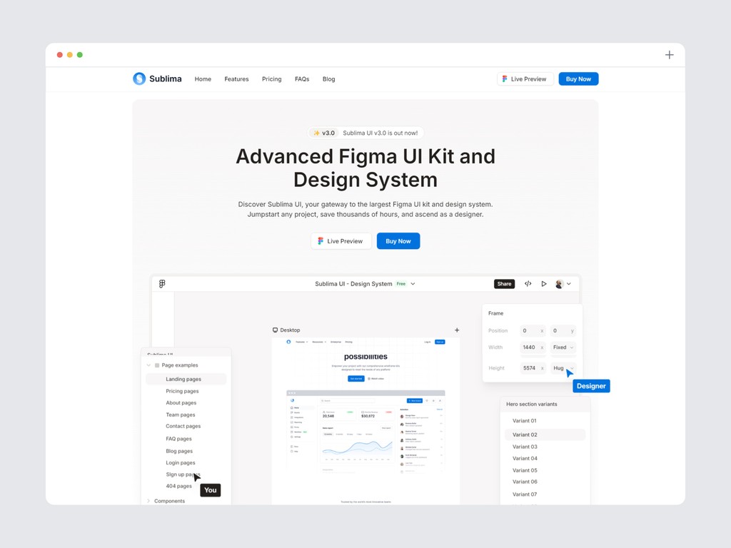
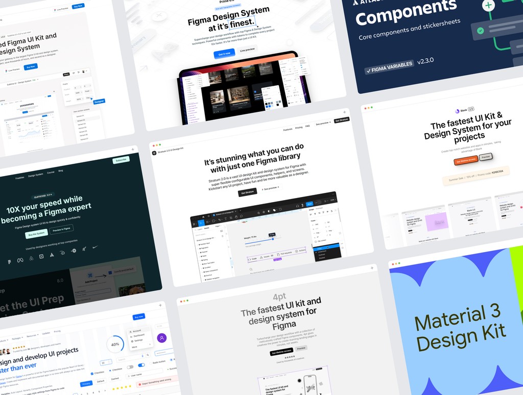
1. Sublima UI
sublimaui.com - From $69 per user
Sublima UI is meticulously crafted with precision, offering more than just a UI kit—it's a comprehensive design solution tailored for every creator. With over 650 ready-to-use desktop and mobile pages, an impressive collection of 10,000+ UI components, and 800+ custom icons, Sublima UI is designed to meet the diverse needs of designers, developers, freelancers, product managers, startups, and UX/UI teams.
This kit utilizes the latest Figma features, including auto layout, variables, and WCAG accessibility, providing you with the tools to create inclusive and flexible designs.
Each element within Sublima UI is thoughtfully designed to streamline your workflow, enhance creativity, and ensure professional outcomes. Whether you're looking to elevate your design process, simplify coding, or boost productivity, this kit is regularly updated to stay ahead of design trends and technological advancements, ensuring your projects always look modern and polished.
Choosing Sublima UI means investing in a versatile, high-quality toolkit that adapts seamlessly to any project. It facilitates collaboration, maintains brand consistency, and accelerates development, making it the perfect fit for anyone looking to create visually stunning and user-centric experiences.
Take a look at the complete preview of the design kit to see everything it includes.
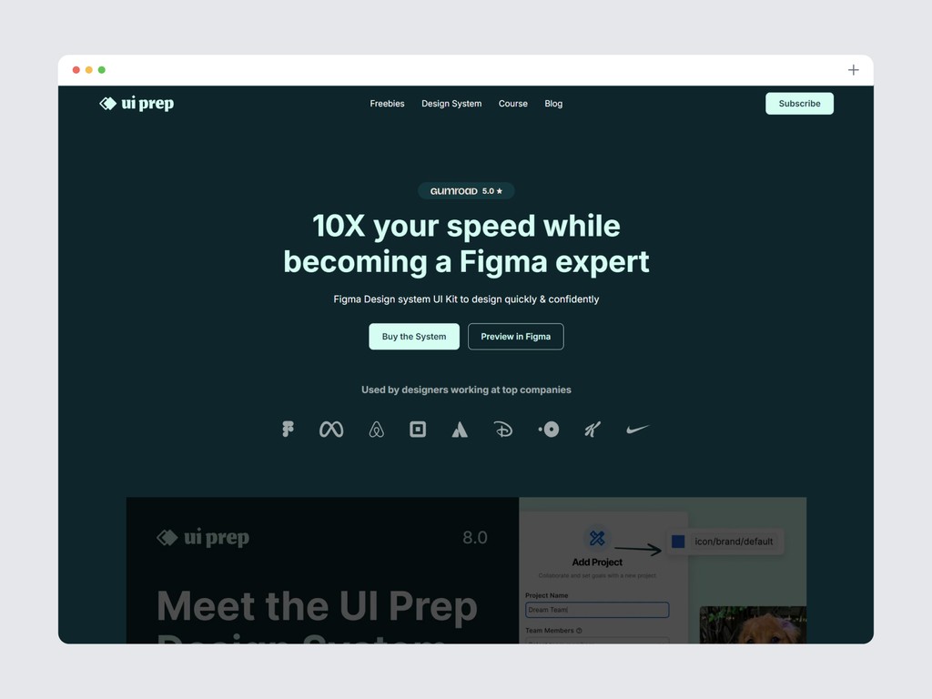
2. UI Prep
uiprep.com - From $99 per user
The UI Prep Design System Kit is crafted to streamline your design process with best practices like full accessibility, an 8pt grid system, and atomic design principles. It includes comprehensive documentation for easy implementation, supports both light and dark modes, and adapts to responsive layouts.
Leverage the latest Figma features such as Color and Text Variables, Component Properties, Variants, Auto Layout, and Interactive Components to enhance your workflow and create dynamic designs.
Beyond its features, the kit offers a Quick Start Guide with detailed tutorials to help you understand and utilize the system effectively, ensuring you get the most out of your design projects.
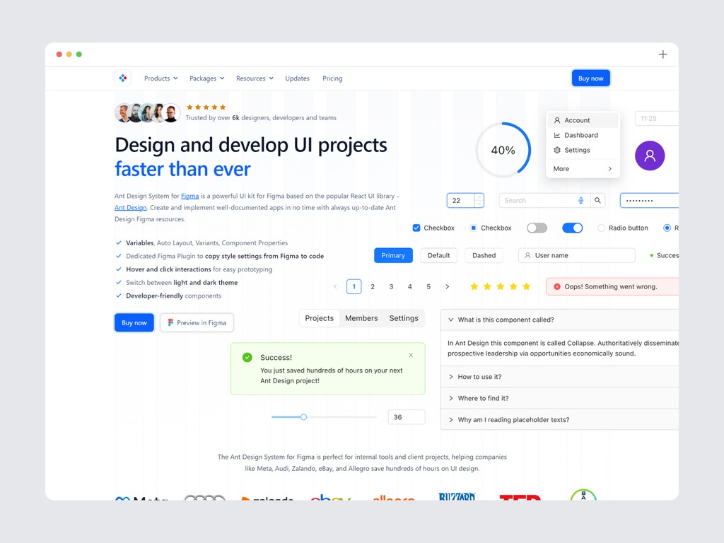
3. Ant design system for figma
antforfigma.com - From $109-$599 per user
The Ant Design System for Figma is a robust UI kit inspired by the popular React library, Ant Design. It simplifies the creation of well-documented apps with up-to-date resources, including Variables, Auto Layout, Variants, and Component Properties. The kit supports hover and click interactions for easy prototyping, and you can switch between light and dark themes effortlessly. With developer-friendly components and over 800 Ant Design icons, this system streamlines design and implementation, making it an invaluable tool for crafting sophisticated, responsive interfaces.
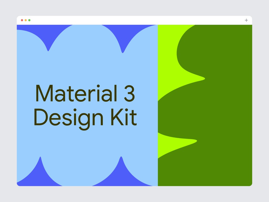
4. Material design kit
material design kit - Free
Google's Material Design is a widely adopted design system that provides a cohesive look and feel across different devices. The Figma kit includes all the essential components following Material Design guidelines. It offers an extensive component library, guidelines for animations and transitions, and is customizable to match your brand’s identity. The robust support and regular updates make it a reliable choice.
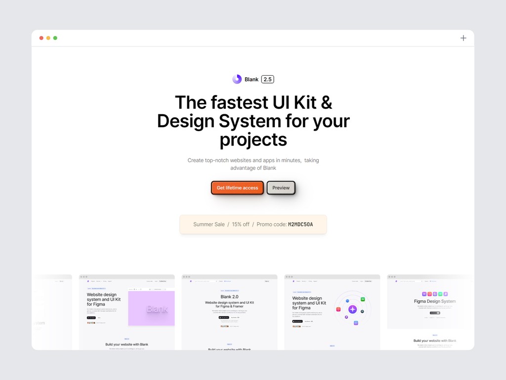
5. Blank UI
useblank.design - From $89 per user
This kit offers an extensive selection of over 3,200 components, each with customizable properties to meet diverse design needs. With more than 300 variable tokens, it provides flexibility and consistency throughout your projects. Ready-to-use templates streamline your workflow, eliminating the need to start from scratch, and include layouts for both desktop and mobile views.
The Blank UI Kit stands out with its thoughtful structure, featuring advanced Auto Layout 4.0 for responsive designs and a robust library of over 150 layouts and more than 2,500 open-source icons. This kit enhances your design process by offering full customization options, clear properties for straightforward adjustments, and a comprehensive toolkit to meet your needs efficiently.
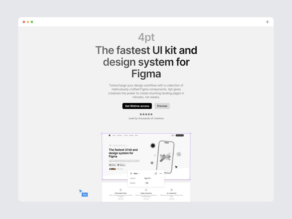
6. 4pt
4pt.website - From $97 per user
The 4pt UI Kit stands out with its extensive collection of over 3,000 meticulously crafted Figma components, providing a vast array of design possibilities. With more than 1,000 integrated icons, it ensures that every interface element you need is at your fingertips, streamlining the design process. The kit's responsive layouts guarantee that your designs will look stunning across all devices, adapting seamlessly to various screen sizes.
Additionally, the integrated design system offers a cohesive framework that ensures consistency and efficiency in your design work. Whether you’re working on a complex project or a simple interface, the 4pt UI Kit is equipped to handle it all with ease and sophistication.
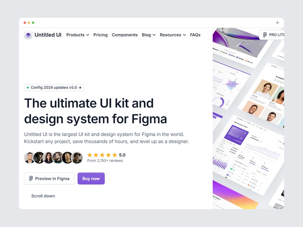
7. Untitled UI
untitledui.com - From $129 per user
The Untitled UI design system kit offers an extensive collection of resources to elevate your design process. With over 900 global styles and variables, including highly intuitive color, typography, and effects styles, you have the flexibility to create consistent and visually appealing designs effortlessly. The kit includes a staggering 10,000+ components and variants, meticulously crafted to cover every possible design scenario, ensuring that you have everything you need at your fingertips.
In addition, you'll find more than 420 page design examples, ready for both desktop and mobile, providing you with a vast array of templates to jumpstart your projects. To top it all off, the kit comes with a library of over 2,000 icons and logos, covering all the essentials—from country flags to payment icons—giving you the tools to build comprehensive and professional designs with ease.
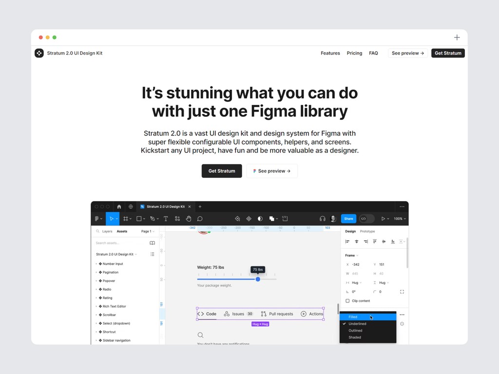
8. Stratum UI kit
stratumkit.com - From $69-$109 per user
Stratum 2.0 stands as a comprehensive UI design kit and design system for Figma, offering an expansive library of highly adaptable UI components, helpers, and screens. This kit is designed to streamline your workflow, whether you're launching a new project or refining an existing one. With Stratum 2.0, you'll have access to thousands of components that leverage all the advanced features Figma has to offer, including Auto Layout and Variables.
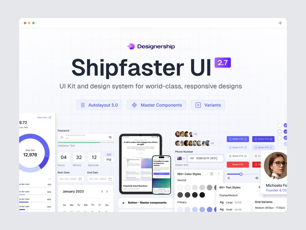
9. Shipfaster
thedesignership.com - From $90 per user
The Shipfaster UI Kit equips you with over 8,000 customizable components to streamline complex designs, complemented by a vast selection of 2,800+ media resources including icons, logos, and device mockups. Benefit from 150+ global styles and 180+ expertly crafted page templates, designed for swift customization.
Explore text styles that snap to a 4-point grid, utilize the 3-level block approach for easy component customization, and create with building blocks. Auto Layout 3.0 ensures components adapt seamlessly, while the 4 and 8-point grids maintain pixel-perfect details. Plus, the kit is WCAG 2.1 compliant, ensuring your designs are accessible and inclusive.
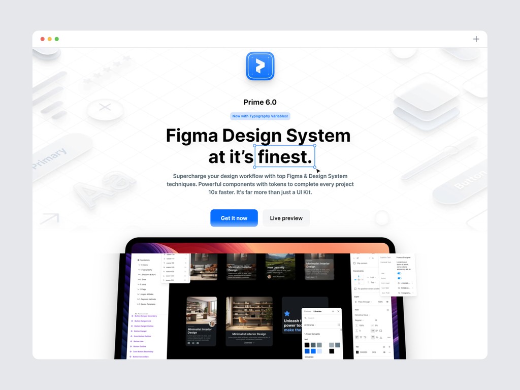
10. Prime design system
primedesignsystem.com - From $89 per user
This kit offers an extensive selection of over 3,100 components, each with customizable properties to meet diverse design needs. It includes sophisticated design system tokens with variables, providing flexibility and consistency throughout your projects. Automatic dark and light mode ensures your designs adapt effortlessly to different lighting conditions.
Additionally, the new auto layout features enhance your workflow, making it easier to adjust designs to various screen sizes. With a strong emphasis on best Figma practices, this kit is designed to elevate your design process and boost productivity.
Why UI kits and design systems matter
UI kits and design systems are indispensable tools in the toolkit of modern designers, and understanding their importance can transform the way you approach design projects.
Uniformity and Consistency: One of the primary benefits of using UI kits and design systems is the ability to ensure a uniform look and feel across your entire project. Consistency in design is crucial for creating cohesive and professional user experiences. A design system provides standardized components and styles, which helps maintain visual consistency and adherence to brand guidelines throughout your project.
Efficiency and Time Savings: Designing from scratch can be time-consuming and labor-intensive. UI kits streamline the design process by offering pre-designed components and templates that you can quickly customize to fit your needs. This not only speeds up the design process but also allows designers to focus on higher-level creative tasks rather than reinventing the wheel with each project.
Scalability: As projects grow and evolve, maintaining a consistent design becomes increasingly challenging. Design systems facilitate scalability by providing a structured framework that can easily accommodate new components and updates. This scalability ensures that your design remains coherent as additional features or screens are added.
Improved Collaboration: Design systems also play a crucial role in enhancing team collaboration. By providing a shared design language and set of guidelines, they help ensure that all team members—designers, developers, and stakeholders—are on the same page. This reduces misunderstandings and discrepancies, leading to more efficient workflows and a smoother design-to-development handoff.
What to look for in a UI kit and design system for figma
Selecting the right UI kit or design system for Figma involves careful consideration of several key factors to ensure it aligns with your project needs and enhances your design workflow.
Comprehensiveness: A high-quality UI kit or design system should offer a comprehensive set of components, styles, and templates that cover all aspects of your design needs. Look for kits that include a wide range of UI elements, such as buttons, forms, navigation bars, and icons, as well as layout templates and design patterns. This breadth of options ensures that you have the necessary tools to build a complete and functional user interface.
Ease of Customization: Flexibility in customization is another crucial factor. The design system should be easy to tailor to fit your brand’s identity and specific project requirements. Look for kits that allow you to easily modify colors, typography, and other design elements without extensive effort. This adaptability ensures that you can maintain brand consistency while leveraging pre-designed components.
Documentation and Usability: Comprehensive and clear documentation is essential for effective use of any design system. Well-documented kits provide detailed guidelines on how to use and implement components, making it easier to integrate them into your project. Look for kits that offer thorough documentation, including usage instructions, best practices, and examples of how to apply the components in real-world scenarios.
Community Support and Updates: An active community and regular updates can significantly impact the value of a UI kit or design system. Kits with strong community support provide access to forums, discussions, and additional resources that can help resolve issues and provide inspiration. Regular updates ensure that the design system remains current with the latest design trends and technological advancements, keeping your designs fresh and relevant.
By considering these factors, you can choose a UI kit or design system for Figma that enhances your design workflow, provides the tools you need for effective design, and supports your project from start to finish.
Top UI kits and design systems for figma
Below are the top UI kits and design systems for Figma that stand out for their comprehensive features, ease of use, and support for modern design practices.
1. Sublima UI
sublimaui.com - From $69 per user
Sublima UI is meticulously crafted with precision, offering more than just a UI kit—it's a comprehensive design solution tailored for every creator. With over 650 ready-to-use desktop and mobile pages, an impressive collection of 10,000+ UI components, and 800+ custom icons, Sublima UI is designed to meet the diverse needs of designers, developers, freelancers, product managers, startups, and UX/UI teams.
This kit utilizes the latest Figma features, including auto layout, variables, and WCAG accessibility, providing you with the tools to create inclusive and flexible designs.
Each element within Sublima UI is thoughtfully designed to streamline your workflow, enhance creativity, and ensure professional outcomes. Whether you're looking to elevate your design process, simplify coding, or boost productivity, this kit is regularly updated to stay ahead of design trends and technological advancements, ensuring your projects always look modern and polished.
Choosing Sublima UI means investing in a versatile, high-quality toolkit that adapts seamlessly to any project. It facilitates collaboration, maintains brand consistency, and accelerates development, making it the perfect fit for anyone looking to create visually stunning and user-centric experiences.
Take a look at the complete preview of the design kit to see everything it includes.
2. UI Prep
uiprep.com - From $99 per user
The UI Prep Design System Kit is crafted to streamline your design process with best practices like full accessibility, an 8pt grid system, and atomic design principles. It includes comprehensive documentation for easy implementation, supports both light and dark modes, and adapts to responsive layouts.
Leverage the latest Figma features such as Color and Text Variables, Component Properties, Variants, Auto Layout, and Interactive Components to enhance your workflow and create dynamic designs.
Beyond its features, the kit offers a Quick Start Guide with detailed tutorials to help you understand and utilize the system effectively, ensuring you get the most out of your design projects.
3. Ant design system for figma
antforfigma.com - From $109-$599 per user
The Ant Design System for Figma is a robust UI kit inspired by the popular React library, Ant Design. It simplifies the creation of well-documented apps with up-to-date resources, including Variables, Auto Layout, Variants, and Component Properties. The kit supports hover and click interactions for easy prototyping, and you can switch between light and dark themes effortlessly. With developer-friendly components and over 800 Ant Design icons, this system streamlines design and implementation, making it an invaluable tool for crafting sophisticated, responsive interfaces.
4. Material design kit
material design kit - Free
Google's Material Design is a widely adopted design system that provides a cohesive look and feel across different devices. The Figma kit includes all the essential components following Material Design guidelines. It offers an extensive component library, guidelines for animations and transitions, and is customizable to match your brand’s identity. The robust support and regular updates make it a reliable choice.
5. Blank UI
useblank.design - From $89 per user
This kit offers an extensive selection of over 3,200 components, each with customizable properties to meet diverse design needs. With more than 300 variable tokens, it provides flexibility and consistency throughout your projects. Ready-to-use templates streamline your workflow, eliminating the need to start from scratch, and include layouts for both desktop and mobile views.
The Blank UI Kit stands out with its thoughtful structure, featuring advanced Auto Layout 4.0 for responsive designs and a robust library of over 150 layouts and more than 2,500 open-source icons. This kit enhances your design process by offering full customization options, clear properties for straightforward adjustments, and a comprehensive toolkit to meet your needs efficiently.
6. 4pt
4pt.website - From $97 per user
The 4pt UI Kit stands out with its extensive collection of over 3,000 meticulously crafted Figma components, providing a vast array of design possibilities. With more than 1,000 integrated icons, it ensures that every interface element you need is at your fingertips, streamlining the design process. The kit's responsive layouts guarantee that your designs will look stunning across all devices, adapting seamlessly to various screen sizes.
Additionally, the integrated design system offers a cohesive framework that ensures consistency and efficiency in your design work. Whether you’re working on a complex project or a simple interface, the 4pt UI Kit is equipped to handle it all with ease and sophistication.
7. Untitled UI
untitledui.com - From $129 per user
The Untitled UI design system kit offers an extensive collection of resources to elevate your design process. With over 900 global styles and variables, including highly intuitive color, typography, and effects styles, you have the flexibility to create consistent and visually appealing designs effortlessly. The kit includes a staggering 10,000+ components and variants, meticulously crafted to cover every possible design scenario, ensuring that you have everything you need at your fingertips.
In addition, you'll find more than 420 page design examples, ready for both desktop and mobile, providing you with a vast array of templates to jumpstart your projects. To top it all off, the kit comes with a library of over 2,000 icons and logos, covering all the essentials—from country flags to payment icons—giving you the tools to build comprehensive and professional designs with ease.
8. Stratum UI kit
stratumkit.com - From $69-$109 per user
Stratum 2.0 stands as a comprehensive UI design kit and design system for Figma, offering an expansive library of highly adaptable UI components, helpers, and screens. This kit is designed to streamline your workflow, whether you're launching a new project or refining an existing one. With Stratum 2.0, you'll have access to thousands of components that leverage all the advanced features Figma has to offer, including Auto Layout and Variables.
9. Shipfaster
thedesignership.com - From $90 per user
The Shipfaster UI Kit equips you with over 8,000 customizable components to streamline complex designs, complemented by a vast selection of 2,800+ media resources including icons, logos, and device mockups. Benefit from 150+ global styles and 180+ expertly crafted page templates, designed for swift customization.
Explore text styles that snap to a 4-point grid, utilize the 3-level block approach for easy component customization, and create with building blocks. Auto Layout 3.0 ensures components adapt seamlessly, while the 4 and 8-point grids maintain pixel-perfect details. Plus, the kit is WCAG 2.1 compliant, ensuring your designs are accessible and inclusive.
10. Prime design system
primedesignsystem.com - From $89 per user
This kit offers an extensive selection of over 3,100 components, each with customizable properties to meet diverse design needs. It includes sophisticated design system tokens with variables, providing flexibility and consistency throughout your projects. Automatic dark and light mode ensures your designs adapt effortlessly to different lighting conditions.
Additionally, the new auto layout features enhance your workflow, making it easier to adjust designs to various screen sizes. With a strong emphasis on best Figma practices, this kit is designed to elevate your design process and boost productivity.
Conclusion
Choosing the right UI kit and design system for Figma can significantly enhance your design workflow, ensuring consistency, scalability, and efficiency. The kits mentioned in this guide are some of the best available, each with unique features and strengths. By implementing these tools, you can focus more on creativity and innovation, bringing your design visions to life with ease.
Remember, the key to a successful design project is not just having the right tools but also knowing how to use them effectively. Happy designing!

Related Blogs
Related Blogs
Related Blogs
Related Blogs
Our latest news and articles


Get Sublima UI Today & Elevate Your Design Skills
Dive into our collection of pre-built UI components and landing page layouts to streamline your workflow and craft remarkable, professional designs in no time.
© 2024 Sublima. All rights reserved.
Get Sublima UI Today & Elevate Your Design Skills
Dive into our collection of pre-built UI components and landing page layouts to streamline your workflow and craft remarkable, professional designs in no time.
© 2024 Sublima. All rights reserved.
Get Sublima UI Today & Elevate Your Design Skills
Dive into our collection of pre-built UI components and landing page layouts to streamline your workflow and craft remarkable, professional designs in no time.
© 2024 Sublima. All rights reserved.
Get Sublima UI Today & Elevate Your Design Skills
Dive into our collection of pre-built UI components and landing page layouts to streamline your workflow and craft remarkable, professional designs in no time.
© 2024 Sublima. All rights reserved.